Replicating MLB’s News Page with CSS Grid and a Dose of Flexbox

Major League Baseball (MLB) uses Flexbox to lay out their News page. See how to reproduce it with Grid while sprinkling in a nested Flexbox component. Also, can we apply sticky positioning to a grid item and have it behave as expected? (Spoiler alert: yes.)
The MLB postseason is upon us, so what better time to look at how we can redo a page from mlb.com with CSS Grid and other goodies. (Incidentally, the NHL’s News page uses a very similar layout as MLB’s.)
Like my Wired.com example, this makeover uses Grid for both the overall page layout (via a parent grid) and components within it (the sidebar links, each a nested grid), demonstrating that Grid can suit both your macro and micro needs. I use Flexbox to lay out the author info for each article.
Following the example and its code, I’ll explain both how it works and how I provided a layout to browsers that don’t support Grid.
(Note: As usual with my site makeovers, I’ve appromixated some font families rather than incur costs for web fonts.)
The Finished Example Layout
News MLB News
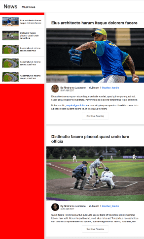
Eius architecto harum itaque dolorem facere


MLB.com @author_handle
Dicta delectus numquam atque itaque veritatis repellat, quod qui tempore quasi nisi, saepe aliquid sapiente cupiditate. Perferendis ea expedita temporibus fugiat commodi.
Nobis eos hic, sequi eligendi dicta obcaecati quisquam aperiam blanditiis consectetur ad neque esse quidem labore ea, in eius quia provident.
Quas, fugit a explicabo autem voluptatem assumenda excepturi nam, temporibus necessitatibus non velit natus reprehenderit illo quidem, aperiam dignissimos. Nemo, voluptate, rem.
Nesciunt repellat, vel rem perferendis dolore voluptatem necessitatibus ad, numquam sint consequatur modi atque ratione id cumque quisquam suscipit molestiae tempore commodi.
Quisquam cupiditate sit natus, esse, alias consectetur, explicabo atque consequatur ipsam repellat sunt amet assumenda eos ullam. Neque accusamus ratione enim et!
Distinctio facere placeat quasi unde iure officia

MLB.com @author_handle
Quam facere illo consequuntur quis iusto saepe libero officia omnis sint consectetur labore, nam velit. Harum impedit nemo, modi eius natus ad. Temporibus necessitatibus non velit natus reprehenderit illo quidem, aperiam dignissimos. Nemo, voluptate, rem.
Laboriosam nemo, impedit nam quam earum ad adipisci aliquam perferendis aliquid tenetur amet veniam a laudantium tempore maxime!
Dolor sit amet, consectetur adipisicing elit. Nesciunt repellat, vel rem perferendis dolore voluptatem necessitatibus ad, numquam sint consequatur modi atque ratione id cumque quisquam suscipit molestiae tempore commodi.
Photos courtesy of Unsplash
The Code
HTML
<main class="MlbWrapper">
  <header class="PageHeader">
    <h1 class="PageHeader__title">News <span>MLB News</span></h1>
  </header>

  <!-- ============================ -->
  <!-- ==== START ARTICLES NAV ==== -->
  <!-- ============================ -->
  <aside class="Sidebar">
    <nav aria-label="articles">
      <ul class="ArticlesNav">
        <li class="ArticlesNav__item">
          <a href="#" class="ArticlesNav__link">
            <img src="img/thumb-01.jpg" width="117" height="66" alt="" class="ArticlesNav__img">
            <p class="ArticlesNav__txt">Eius architecto harum itaque dolorem facere</p>
          </a>
        </li>
        <li class="ArticlesNav__item">
          <a href="#" class="ArticlesNav__link">
            <img src="img/thumb-02.jpg" width="117" height="66" alt="" class="ArticlesNav__img">
            <p class="ArticlesNav__txt">Distinctio facere placeat quasi unde iure officia</p>
          </a>
        </li>
        <li class="ArticlesNav__item">
          <a href="#" class="ArticlesNav__link">
            <img src="img/thumb-03.jpg" width="117" height="66" alt="" class="ArticlesNav__img">
            <p class="ArticlesNav__txt">Aspernatur et ratione saepe possimus</p>
          </a>
        </li>
        <li class="ArticlesNav__item">
          <a href="#" class="ArticlesNav__link">
            <img src="img/thumb-03.jpg" width="117" height="66" alt="" class="ArticlesNav__img">
            <p class="ArticlesNav__txt">Aspernatur et ratione saepe possimus</p>
          </a>
        </li>
        <li class="ArticlesNav__item">
          <a href="#" class="ArticlesNav__link">
            <img src="img/thumb-03.jpg" width="117" height="66" alt="" class="ArticlesNav__img">
            <p class="ArticlesNav__txt">Aspernatur et ratione saepe possimus</p>
          </a>
        </li>
      </ul>
    </nav>
  </aside>
  <!-- end articles nav -->

  <!-- ======================== -->
  <!-- ==== START ARTICLES ==== -->
  <!-- ======================== -->
  <div class="Articles">
    <!-- :::: Start article #1 :::: -->
    <article class="Article">
      <h1 class="Article__headline">Eius architecto harum itaque dolorem facere</h1>
      <img
        sizes="
          (max-width: 1023px) 100vw,
          (max-width: 1284px) calc(100vw - 332px),
          952px"
        srcset="
          img/photo-01-480x270.jpg 480w,
          img/photo-01-867x488.jpg 867w,
          img/photo-01-1024x576.jpg 1024w"
        src="img/photo-01-1024x576.jpg"
        alt="A right-handed pitcher in his windup, about to deliver a pitch"
        class="Article__photo">

      <div class="Article__content Article__content--snippet">
        <header class="Author">
          <img src="img/author-01.jpg" alt="" class="Author__img">
          <p class="Author__info">
            <span class="Author__byline">By Firstname Lastname</span>
            <span class="Author__source">MLB.com</span>
            <a href="#">@author_handle</a>
          </p>
          <time class="Author__date" datetime="2018-10-05T05:07:16-0400">5:07 AM EDT</time>
        </header>

        <p>Dicta delectus numquam atque itaque veritatis repellat, quod qui tempore quasi nisi, saepe aliquid sapiente cupiditate. Perferendis ea expedita temporibus fugiat commodi.</p>
        <p>Nobis eos hic, <a href="#">sequi eligendi dicta</a> obcaecati quisquam aperiam blanditiis consectetur ad neque esse quidem labore ea, in eius quia provident.</p>
      </div>

      <a href="#" class="Article__btn js-article-btn">Continue Reading</a>

      <div class="Article__content Article__content--body">
        <p>Quas, fugit a explicabo autem voluptatem assumenda excepturi nam, temporibus necessitatibus non velit natus reprehenderit illo quidem, aperiam dignissimos. Nemo, voluptate, rem.</p>
        <p>Nesciunt repellat, vel rem perferendis dolore voluptatem necessitatibus ad, numquam sint consequatur modi atque ratione id cumque quisquam suscipit molestiae tempore commodi.</p>
        <p>Quisquam cupiditate sit natus, esse, alias consectetur, explicabo atque consequatur ipsam repellat sunt amet assumenda eos ullam. Neque accusamus ratione enim et!</p>

        <footer class="Article__footer">
          <p><a href="#">Firstname Lastname</a> has been a reporter for MLB.com since 2012. She also hosts a weekly podcast. Follow her on Twitter at <a href="#">@author_handle</a>.</p>
        </footer>
      </div>
    </article>
    <!-- end article #1 -->

    <!-- :::: Start article #2 :::: -->
    <article class="Article">
      <h1 class="Article__headline">Distinctio facere placeat quasi unde iure officia</h1>
      <img
        sizes="
          (max-width: 1023px) 100vw,
          (max-width: 1284px) calc(100vw - 332px),
          952px"
        srcset="
          img/photo-02-480x270.jpg 480w,
          img/photo-02-897x505.jpg 897w,
          img/photo-02-1024x576.jpg 1024w"
        src="img/photo-02-1024x576.jpg"
        alt="" class="Article__photo">

      <div class="Article__content Article__content--snippet">
        <header class="Author">
          <img src="img/author-02.jpg" alt="" class="Author__img">
          <p class="Author__info">
            <span class="Author__byline">By Firstname Lastname</span>
            <span class="Author__source">MLB.com</span>
            <a href="#">@author_handle</a>
          </p>
          <time class="Author__date" datetime="2018-10-05T04:26:45-0400">4:26 AM EDT</time>
        </header>

        <p>Quam facere illo consequuntur quis iusto saepe libero officia omnis sint consectetur labore, nam velit. Harum impedit nemo, modi eius natus ad. Temporibus necessitatibus non velit natus reprehenderit illo quidem, aperiam dignissimos. Nemo, voluptate, rem.</p>
      </div>

      <a href="#" class="Article__btn js-article-btn">Continue Reading</a>

      <div class="Article__content Article__content--body">
        <p>Laboriosam nemo, impedit nam quam earum ad adipisci aliquam perferendis aliquid tenetur amet veniam a laudantium tempore maxime!</p>
        <p>Dolor sit amet, consectetur adipisicing elit. Nesciunt repellat, vel rem perferendis dolore voluptatem necessitatibus ad, numquam sint consequatur modi atque ratione id cumque quisquam suscipit molestiae tempore commodi.</p>

        <footer class="Article__footer">
          <p><a href="#">Firstname Lastname</a> has been a reporter for MLB.com since 2012. He also hosts a weekly podcast. Follow him on Twitter at <a href="#">@author_handle</a>.</p>
        </footer>
      </div>
    </article>
    <!-- end article #2 -->

    <!-- :::: More articles would go here :::: -->
  </div>
  <!-- end articles -->

  <p class="Credit Credit--ctr">Photos courtesy of <a href="https://unsplash.com/">Unsplash</a></p>
</main>

<script>
// Note: using ES5 for broader browser compatibility

/*
 * Show rest of article when "Continue Reading" button used
 */
(function () {
  'use strict';
  var btn;
  var i = 0;
  var btns = document.querySelectorAll('.js-article-btn');

  while ((btn = btns.item(i++))) {
    btn.addEventListener('click', function(e) {
      e.preventDefault();
      // hide button
      this.style.display = 'none';
      // show full article
      this.previousElementSibling.style.display = 'block';
      this.nextElementSibling.style.display = 'block';
    });
  }
})();
</script>
CSS
* {
  box-sizing: border-box;
}

body {
  margin: 0;
}

/* for IE11 and other old browsers that don't support the <main> element. without this rule, they won't display the gray around the articles. */
.MlbWrapper {
  display: block;
}

/* GRID
-------------------------------------- */
@media screen and (min-width: 64rem) {
  /* :::: Overall Page Layout :::: */
  /* Define the grid */
  .MlbWrapper {
    display: grid;
    grid-template-columns: 1fr 316px 16px minmax(692px, 952px) 1fr;
  }
  /* Place items on the grid */
  .PageHeader {
    grid-column: 1 / -1;
  }
  .Sidebar {
    grid-column: 2;
  }
  .Articles {
    grid-column: 4;
  }
}

/* :::: Article Links in Sidebar :::: */
/* Define the nested grids */
.ArticlesNav__link {
  align-items: center;
  display: grid;
  grid-column-gap: 10px;
  /* thumbnail is 117px. text takes up the rest. */
  grid-template-columns: 117px 1fr;
}

/* STYLING
-------------------------------------- */
/* ::::::::::::::::::::::::::::::: */
/* :::: Wrapper of whole page :::: */
/* ::::::::::::::::::::::::::::::: */
.MlbWrapper {
  background-color: #ececec;
  color: #333;
  font-family: "Helvetica Neue", Helvetica, Arial, sans-serif;
}

/* ::::::::::::::::::::: */
/* :::: Page Header :::: */
/* ::::::::::::::::::::: */
.PageHeader {
  align-items: center;
  background-color: #fff;
  border-top: 1px solid #d2d2d2;
  box-shadow: 0 2px 3px rgba(0, 0, 0, 0.1);
  display: flex;
  height: 3rem;
  min-height: 3.0625rem;
  padding-left: 5%;
  position: relative;
  z-index: 1;
}

@media screen and (min-width: 35.5625rem) {
  .PageHeader {
    min-height: 5.625rem;
    padding-left: 2.5%;
  }
}

@media screen and (min-width: 81.5rem) {
  .PageHeader {
    padding-left: 0;
  }
}

.PageHeader__title {
  font-size: 1.6875rem;
  font-weight: 500;
  line-height: 1;
  margin: 0;
}

@media screen and (min-width: 48rem) {
  .PageHeader__title {
    font-size: 2.375rem;
  }
}

@media screen and (min-width: 81.5rem) {
  .PageHeader__title {
    margin-left: auto;
    margin-right: auto;
    width: 1284px;
  }
}

.PageHeader__title span {
  font-size: .575em;
}

@media screen and (min-width: 48rem) {
  .PageHeader__title span {
    font-size: .5em;
    vertical-align: middle;
  }
}

.PageHeader__title span:before {
  content: '';
  display: inline-block;
  width: 1px;
  height: 20px;
  background: #d2d2d2;
  margin-left: 7px;
  margin-right: 14px;
  position: relative;
  top: 3px;
}

@media screen and (min-width: 48rem) {
  .PageHeader__title span:before {
    margin-left: 6px;
    margin-right: 15px;
  }
}

/* for browsers that don't support grid */
.Articles {
  max-width: 1024px;
  margin-left: auto;
  margin-right: auto;
}

/* undo what was set for browsers that don't support grid */
@supports (display: grid) {
  .Articles {
    max-width: none;
    margin-left: 0;
    margin-right: 0;
  }
}

/* :::::::::::::::::::::: */
/* :::: News Article :::: */
/* :::::::::::::::::::::: */
.Article {
  background-color: #fff;
  box-shadow: 0 2px 3px rgba(0, 0, 0, 0.1);
  margin-bottom: 16px;
  padding-bottom: 32px;
  padding-top: 56px;
}

.Article a:not(.Article__btn) {
  color: #4c8cee;
  font-weight: bold;
  text-decoration: none;
}

.Article__headline {
  font-size: 1.25rem;
  font-weight: bold;
  line-height: 1.19986;
  max-width: 764px;
  width: 90%;
  margin: 0 auto 19px;
}

@media screen and (min-width: 48rem) {
  .Article__headline {
    font-size: 1.8125rem;
  }
}

.Article__photo {
  display: block;
  margin-bottom: 16px;
  max-width: 100%;
}

.Article__content {
  font-size: 0.875rem;
  margin: auto;
  max-width: 764px;
  width: 90%;
}

@media screen and (min-width: 48rem) {
  .Article__content {
    font-size: 1rem;
  }
}

@media screen and (max-width: 63.9375rem) {
  .Article__content--snippet {
    display: none;
  }
}

.Article__content--body {
  display: none;
}

.Article__content p {
  line-height: 1.5;
}

.Article__footer {
  font-style: italic;
}

.Article__btn {
  color: #666;
  background-color: #fff;
  border: 1px solid #d2d2d2;
  border-radius: 5px;
  display: table;
  font-size: 0.9375rem;
  font-weight: 500;
  line-height: 1;
  margin: 0 auto;
  padding: 1rem 2rem;
  text-decoration: none;
  text-shadow: 0 1px 0 #fff;
  transition: .2s;
}

.Article__btn:hover {
  background-color: #ececec;
}

@media screen and (max-width: 63.9375rem) {
  .Article__btn {
    margin-top: 32px;
  }
}

/* ::::::::::::::::::::::::::::: */
/* :::: Author Photo + Info :::: */
/* ::::::::::::::::::::::::::::: */
.Author {
  font-size: 0.75rem;
  font-weight: bold;
  align-content: flex-start;
  display: flex;
  flex-direction: column;
  flex-wrap: wrap;
  height: 55px;
  justify-content: center;
}

@media screen and (min-width: 35.5625rem) {
  .Author {
    font-size: 0.875rem;
  }
}

@media screen and (min-width: 48rem) {
  .Author {
    font-size: 1rem;
  }
}

.Author__img {
  border-radius: 50%;
  display: inline-block;
  height: 55px;
  margin-right: 10px;
  width: 55px;
}

.Author__info {
  margin: 0;
}

.Author__source:after, .Author__source:before {
  content: '';
  display: inline-block;
  width: 1px;
  height: 13px;
  border-right: 1px solid #4a4a4a;
}

.Author__source:after {
  margin: 0 5px 0 10px;
}

.Author__source:before {
  margin: 0 10px 0 5px;
}

.Author__date {
  color: #999;
  display: block;
  line-height: 1;
}

.Sidebar {
  display: none;
}

@supports (display: grid) {
  @media screen and (min-width: 64rem) {
    .Sidebar {
      align-self: start;
      display: block;
      position: sticky;
      top: 0;
      will-change: top;
    }
  }
}

/* ::::::::::::::::::::::::::::: */
/* :::: Articles Navigation :::: */
/* ::::::::::::::::::::::::::::: */
.ArticlesNav {
  list-style: none;
  margin-bottom: 0;
  margin-top: 16px;
  padding: 0;
}

.ArticlesNav__item {
  border-bottom: 1px solid #d2d2d2;
}

.ArticlesNav__link {
  background-color: #fff;
  color: #333;
  padding: 16px;
  text-decoration: none;
}

.ArticlesNav__link:hover {
  background-color: #002e6d;
  color: #fff;
}

.ArticlesNav__txt {
  font-size: 0.9375rem;
  font-weight: 500;
  line-height: 1.2;
  margin: 0;
}
How Does It Work?
In this breakdown we’ll cover:
- the basic HTML structure;
- using Grid for the overall page layout;
- applying Grid to the sidebar links;
- mixing Grid and
position: stickyon the sidebar; - and accommodating browsers that don’t support Grid.
The Basic HTML Structure
Before we get into the CSS, let’s take a quick look at how I’ve set up the HTML bones of the page. This will help you understand how the CSS relates to it.
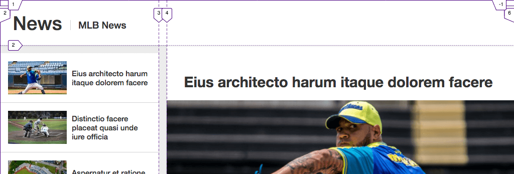
Fig 1 shows the HTML structure minus most of the content. When we’re done adding the CSS, and the viewport is wide enough for multiple columns:
- the
headerwith the.PageHeaderclass will span the full width of the viewport; - the
asidewith the.Sidebarclass will appear on the left (below.PageHeader); - and the
divwith the.Articlesclass will appear to the right (also below.PageHeader).
<!-- .MlbWrapper is our parent grid container -->
<main class="MlbWrapper">
  <!-- child 1 of parent grid -->
  <header class="PageHeader">
    <h1 class="PageHeader__title">News <span>MLB News</span></h1>
  </header>

  <!-- child 2 of parent grid -->
  <aside class="Sidebar">
    <nav aria-label="articles">
      <ul class="ArticlesNav">
        <li class="ArticlesNav__item">
          <!-- each link is a nested grid container -->
          <a href="#" class="ArticlesNav__link">
            ...
          </a>
        </li>
        ... more <li>s ...
      </ul>
    </nav>
  </aside>

  <!-- child 3 of parent grid -->
  <div class="Articles">
    ...
  </div>
</main>
Note: From hereon, I’ll often use terms like .MlbWrapper and .Sidebar as shorthand for the HTML elements that have those classes. The reason being, I think it would be much clunkier to say, for example, <header class="PageHeader"> instead of simply .PageHeader every time I want to refer to that part. Whenever there is the risk of ambiguity, I’ve made efforts to be clear about whether I'm referring to an HTML element that has that class or to that class selector in the CSS.
Using Grid for the Overall Page Layout (the Parent Grid)
By “overall page layout,” I mean the primary columns and rows that hold the page together, rather than units inside of them that use Grid or Flexbox for their layout.
In keeping with MLB’s News page, until the viewport is 1024px wide, the page displays in a single column, and the sidebar containing the links to other articles is hidden. (Note: the point at which the layout switches will be different if the user has changed the browser’s default font size via its settings menu.) This is also mostly the same view I’ve decided to show in browsers that don’t support Grid (namely IE).
Understanding our target layout
To explain how the overall page layout works when Grid comes into play, let’s examine what we want, and then go through the CSS that gets us there.
This is what we want to get to:
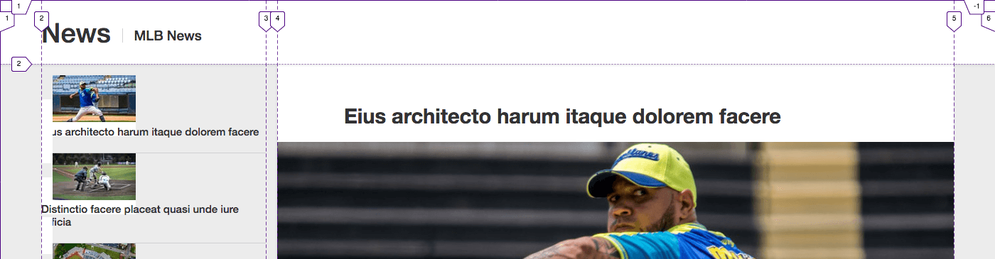
The grid has five columns in both cases, even though at 1024px-wide, the layout appears to only have three. Note that there is no space on the sides in the first screenshot but a sizable gutter on each side in the second because the viewport is wider. In the second case, the content is displayed at its maximum width: 1284px. The surrounding gutters (i.e., columns one and five) expand as needed to fill the remaining free space in the viewport.
But what is that remaining space? Well, minus the side gutters, the column widths break down like this:
- sidebar: always 316px
- space between sidebar and articles: always 16px
- articles: a minimum of 692px and a maximum of 952px (that is, it grows or shrinks to remain within these boundaries)
Adding those up, we get:
- a minimum total content width of 1024px (316 + 16 + 692 = 1024);
- and a maximum total content width of 1284px (316 + 16 + 952 = 1284).
This means that no side gutters display in any viewport width from 1024px to 1284px. From 1285px and beyond, the side gutters grow as much as is necessary to fill out the viewport. To this point, the first screenshot in Fig 2 is 1024px wide, hence no gutters. The second is 1400px, meaning the remaining available space for the gutters is 116px (1400 - 1284 = 116). Each gutter gets half of that, which is 58px.
So no matter how wide the viewport, this approach centers our page without having to apply a technique such as margin-left: auto; margin-right: auto; on an additional wrapper.
Defining the grid
Now that you know how the numbers break down, the CSS to achieve the layout should mostly make sense to you even if the syntax isn’t completely familiar:
@media screen and (min-width: 64rem) {
  /* Define the grid */
  .MlbWrapper {
    display: grid;
    grid-template-columns: 1fr 316px 16px minmax(692px, 952px) 1fr;
  }
}
The 1fr value for the first and last columns holds the magic of the side gutters: each side is assigned 1 fraction of the available space. As we saw in Fig 2, that fraction can equate to 0 depending on the width of the viewport, essentially turning our five-column layout into one that appears to be only three. I like to refer to this as collapsing columns. I used the same technique in “Replicating a Boston Globe Layout with CSS Grid” (see the “Setting up the grid across breakpoints” section.)
Just to drive the point home about the fr unit, if we’d set the first column (the left gutter) to 2fr, it would be twice as wide as the right gutter, no longer centering our content on the page.
The other parts of the grid-template-columns declaration in Fig 3 are probably self-explanatory, but so as not to leave you potentially wondering, they implement the goals stated earlier, enforcing these column widths:
- sidebar (column two): always 316px
- space between sidebar and articles (column three): always 16px
- articles (column four): a minimum of 692px and a maximum of 952px
I didn’t use grid-column-gap to achieve the 16px space between the sidebar and articles because that would have put a 16px-gap between every column, including our 1fr side columns, even when they equate to 0 width. (A column of 0 width is still a column nonetheless.) That would effectively mean we’d always have a minimum of 16px of space on the sides instead of 0, changing our desired behavior.
Currently, it’s not possible in Grid to assign a gap between some columns or rows in a grid and not the others when using grid-column-gap or grid-row-gap, respectively, or the shorthand gap property. Whatever value you assign as the column gap applies to all columns. Ditto for the row gap and all rows.
Placing the items on the grid
As shown in Fig 1, the outer grid has three grid items: .PageHeader, .Sidebar, and .Articles. Let’s place them on the grid we defined in Fig 3:
@media screen and (min-width: 64rem) {
  /* Define the grid (code from Fig 3) */
  .MlbWrapper {
    display: grid;
    grid-template-columns: 1fr 316px 16px minmax(692px, 952px) 1fr;
  }

  /* NEW: place items on the grid */
  .PageHeader {
    grid-column: 1 / -1;
  }
  .Sidebar {
    grid-column: 2;
  }
  .Articles {
    grid-column: 4;
  }
}
The only line I suspect you might be unsure about is grid-column: 1 / -1. That tells .PageHeader to start at grid line 1 and span all columns, no matter how many the grid has. (-1 is shorthand for the last grid line.) So if we were to add, say, three more columns, .PageHeader would span all eight columns automatically with no extra effort required by us. And we’d want that so .PageHeader’s white background (defined elsewhere) always extends the full width of the viewport.
Adding the styles from Fig 4 gives us this overall page layout:
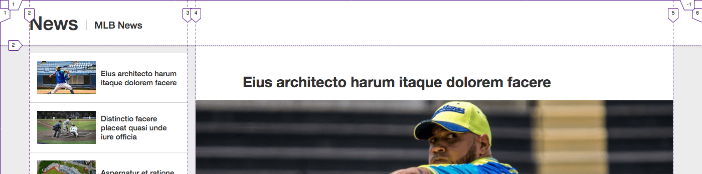
For now, we’re only concerned with the overall page layout—which is done!—so disregard that the article links in the sidebar look messy. We’ll address those in a minute when we make each one a grid of its own.
Why isn’t the page title text flush left?
But before we move on, I want to quickly point out why the text “News | MLB News” is indented. After all, it’s in a child of .PageHeader, which we know spans the width of the viewport, so you would expect it to be flush left instead. So why isn’t it?
Well, elsewhere in the CSS, I have these two rules:
@media screen and (min-width: 81.5rem) {
  /* The parent of .PageHeader__title */
  .PageHeader {
    /* (undo padding set for narrower viewports) */
    padding-left: 0;
  }

  /* This contains the text itself */
  .PageHeader__title {
    margin-left: auto;
    margin-right: auto;
    width: 1284px;
  }
}
This makes the “News | MLB News” title the same width as the content below it and centers the element on the page. The text in the element is flush left, but its container is centered and 1284px wide. In Fig 6, I’ve added a red background to .PageHeader__title so it’s clear what I mean:
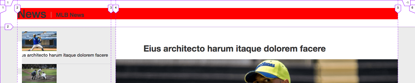
The white space around the red is from the title’s parent, .PageHeader.
Applying Grid to the Sidebar Links
When we finished the overall page layout, the .Sidebar links looked just a bit out of sorts (Fig 5). Fortunately, cleaning them up is pretty straightforward. We’ll make each link its own grid. The thumbnail image will occupy column one, and its corresponding text will occupy column two:
HTML
<!-- one article link item -->
<li class="ArticlesNav__item">
  <a href="#" class="ArticlesNav__link">
    <img src="img/thumb-01.jpg" width="117" height="66" alt="" class="ArticlesNav__img">
    <p class="ArticlesNav__txt">Eius architecto harum itaque dolorem facere</p>
  </a>
</li>
...
CSS
.ArticlesNav__link {
  align-items: center;
  display: grid;
  grid-column-gap: 10px;
  /* thumbnail is 117px. text takes up the rest. */
  grid-template-columns: 117px 1fr;
}
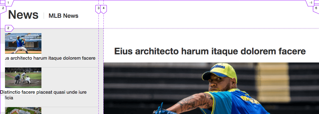
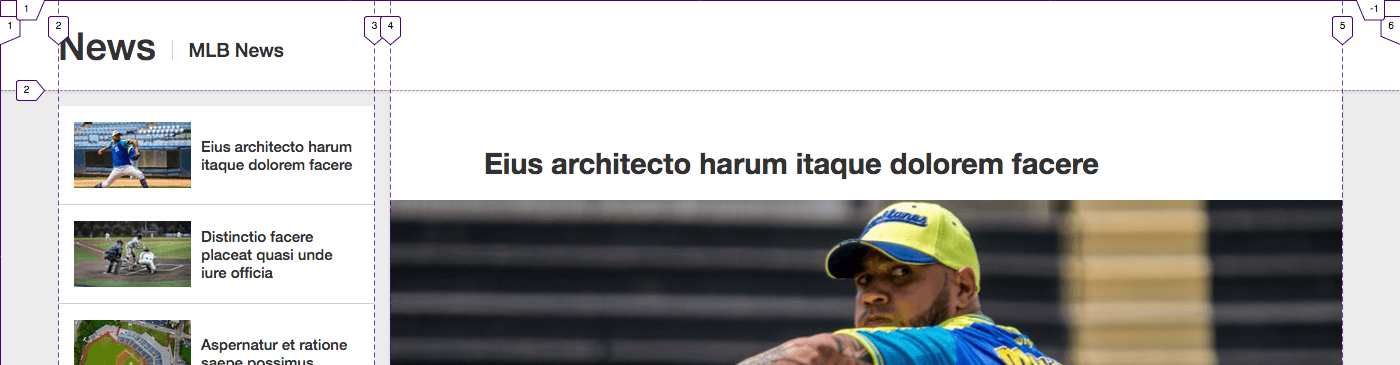
That’s all it takes! I didn’t have to explicitly place the thumbnail in column one and the text in column two because Grid’s auto-placement algorithm takes care of that, slotting them in the columns per their HTML source order (Fig 7).
The align-items: center line makes the text center vertically, ensuring each link will look good regardless of the number of text lines it has, like so:
Elsewhere I’d added padding: 16px to each link to get the whitespace around the image and text.
That completes the layout!
Couldn’t/shouldn’t you use Flexbox for the links instead?
Yes, you could use Flexbox for the links, and that would be perfectly fine. In fact, I did just that in my first pass of coding them. But I switched them, figuring it was an opportunity to reinforce that Grid can be used for layouts both big and small.
As part of considering the change, I knew the switch wouldn’t negatively affect Internet Explorer 11 users—or anyone else using a browser that doesn’t support Grid—because the layout they are shown doesn’t have the sidebar, as I mentioned earlier. (You can certainly debate the merits of that decision, but considering this is a demo, I figured it was reasonable, and MLB had already set that precedent for some users.) Hypothetically, if IE11 users were to be shown the sidebar, I could do the links in Grid and provide a Flexbox fallback for IE11, but why do the layout twice when the result would be the same? So, in that case, I would use Flexbox for the links for all browsers, regardless of Grid support.
By contrast, elsewhere on the page, I used Flexbox instead of Grid for the article author info (their name, round photo, etc.), because IE11 users will see that. Ultimately, the choice between Flexbox and Grid for your own pages depends on a combination of the circumstances and your (or your team’s) preference at times when either would be fine.
Just in case you’re curious, here’s one way you could do the links with Flexbox:
.ArticlesNav__link {
  align-items: center;
  display: flex;
}

.ArticlesNav__img {
  margin-right: 10px;
}
Can Grid and sticky positioning coexist?
With the layout done, let’s turn our attention elsewhere. One of the main things that drew me to creating this makeover was the behavior of MLB’s page in wide viewports: once you scroll down a bit, the sidebar navigation locks in place, no longer scrolling away as you continue to scroll the page. (They also implement an internal scroll on the list of links; I didn’t replicate that.)
The following screenshot of my page (Fig 9) illustrates the point. It’s what we’ll get after applying the CSS I’ll show you in a bit (Fig 10).
MLB.com implements this behavior with a combination of JavaScript and position: fixed. I suspect this may be because IE11 doesn’t support position: sticky, and with a high-traffic site, MLB understandably wants to cater to a very broad user base.
Again because this is a demo, I can take some liberties with browser support that they might not. So I wondered, What would happen if I were to apply position: sticky to part of a Grid layout? It hadn’t occurred to me to try before. Would it behave as hoped? Would it fall apart? (If sticky positioning is new to you, MDN and “position: sticky is Amazing” explain it.)
I fiddled with a couple simple proofs-of-concept first to be sure it would work. Then after coding the MLB page, I applied the behavior with this:
@media screen and (min-width: 64rem) {
  .Sidebar {
    align-self: start;
    position: sticky;
    top: 0;
    will-change: top; /* not required */
  }
}
Again, that CSS results in what we saw in Fig 9.
The sidebar is stuck to top: 0, but you’ll notice a small gray space above the list of article links that might give the impression that the sidebar isn’t at top: 0. That space comes from margin-top: 16px set on the .ArticlesNav list.
align-self: start.In addition to the position and top values being required, the sidebar’s sticky behavior won’t work without the align-self: start line. That sets the sidebar’s height to the height of its content (the list of links). Otherwise, the sidebar’s height would stretch the full length of the page content, as shown in Fig 11. And by rule, “sticky stops working when the bottom of the stuck element hits the bottom of its containing element” (MDN). (Technically, it’s a little more complicated than that.) In this case, .MlbWrapper (Fig 1) is the containing element.
So, by adding align-self: start, we shrink-wrap .Sidebar around its content, making it significantly shorter than its containing element, which allows it to stick. A screenshot of that wouldn’t show any red below the list of links.
That does it for the sticky behavior, but the will-change: top line might also have caught your attention. It’s not required to make the sticky behavior work. I included it because in supporting browsers, it improves the page scrolling performance by preventing the sidebar from being repainted whenever you scroll. (Learn more at MDN.)
Accommodating Browsers that Don’t Support Grid
This makeover also demonstrates how you can provide a good experience to browsers that don’t support Grid—often with little additional CSS required.
In this case, as I mentioned at the outset, those older browsers get a similar single-column layout as viewports narrower than 1024px. Specifically:
- The sidebar is hidden (like on mlb.com/news/).
- The articles display the same, with two exceptions: 1) they’re constrained to a maximum width of 1024px (rather than 1023px), and 2) they’re centered on the page when the viewport exceeds 1024px wide.
Most importantly, I did not have to create separate, entire layouts for Grid and non-Grid browsers. Instead, the majority of the CSS is the same, and to accommodate non-Grid browsers, this is all I needed to do:
/* SIDEBAR
-------------------------------------- */
/* Hide it by default, in keeping with what MLB does
  when viewport is less than 1024px wide.
  For our purposes, it also hides it from non-Grid
  browsers regardless of viewport width. */
.Sidebar {
  display: none;
}

/* Unhide the sidebar for Grid browsers */
@supports (display: grid) {
  @media screen and (min-width: 64rem) {
    .Sidebar {
      display: block;
    }
  }
}

/* ARTICLES
-------------------------------------- */
/* For non-Grid browsers */
.Articles {
  max-width: 1024px;
  margin-left: auto;
  margin-right: auto;
}

/* For Grid browsers, undo what was set */
@supports (display: grid) {
  .Articles {
    max-width: none;
    margin-left: 0;
    margin-right: 0;
  }
}
In short, I provided default styles for browsers that don’t support Grid, and then I changed those styles as necessary for supporting browsers with @supports (display: grid) { } rules.
The @supports rule is known as a feature query, and if this is your first time seeing one, I bet you already know how it works: if the browser supports the listed feature (such as display: grid), it’ll apply the styles inside the rule. Otherwise, the browser will ignore them.
Here is the result of Fig 12 in IE11:
I could add more default and @supports rules as desired. Or even reduce them; I saw no adverse effects from not overriding the auto margins with margin-left: 0 and margin-right: 0, but I overrode them anyway in case a side-effect would crop up in some scenario I hadn’t tested or considered.
And that’ll do it for this makeover.
Thanks ...
and see you next time!