Replicating the Core of Wired’s Homepage with CSS Grid

Wired’s homepage uses Flexbox extensively but not Grid. There’s nothing wrong with that, but how might you achieve some of its layout with Grid instead? Let’s find out.
| Updated:
This makeover is a good example of how you can use CSS Grid for both your overall page layout (via a parent grid) and components within it (via one or more nested grids), as appropriate.
I’ve recreated the top portion of Wired’s homepage minus the site header. This area contains many of the core pieces of their design system; they reuse them further down their page along with similar elements. After the finished layout and its code, I explain in-depth how it works.
(Note: As usual with my site makeovers, I’ve appromixated some font families rather than incur costs for web fonts.)
The Finished Example Layout


The Code
HTML
<div class="WiredBg">
<div class="WiredWrapper">
  <main class="Content">
    <!-- =========================== -->
    <!-- ==== START TOP STORIES ==== -->
    <!-- =========================== -->
    <section class="Stories Stories--top">
      <h1 class="HeadingSection HeadingSection--top">Top Stories</h1>

      <div class="Cards">
        <!-- Card 1 -->
        <div class="Card Card--standard">
          <a href="#">
            <img src="img/camera-373x210.jpg" srcset="img/camera-373x210.jpg 373w, img/camera-827x465.jpg 827w" sizes="(min-width: 900px) 373px, 827px" alt="" class="Card__img">
            <p class="Card__subject">Subject</p>
            <h2 class="Card__heading Card__heading--lg">Excepteur Sint Occaecat Cupidatat Non Proident Sunt in Culpa</h2>
          </a>
          <a href="#" rel="author" class="Card__byline">Author Name</a>
        </div>
        <!-- end card -->

        <!-- Card 2 -->
        <div class="Card Card--narrow">
          <a href="#">
            <img src="img/building-163x163.jpg" srcset="img/building-163x163.jpg 163w, img/building-827x465.jpg 827w" sizes="(min-width: 900px) 163px, 827px" alt="" class="Card__img">
            <p class="Card__subject">Subject</p>
            <h2 class="Card__heading Card__heading--lg">Dolore eu Fugiat Nulla Pariatur Ut Enim ad Minim</h2>
          </a>
          <a href="#" rel="author" class="Card__byline">Author Name</a>
        </div>
        <!-- end card -->

        <!-- Card 3 -->
        <div class="Card Card--small-1 Card--horiz">
          <a href="#">
            <img src="img/space-125x125.jpg" srcset="img/space-125x125.jpg 125w, img/space-827x465.jpg 827w" sizes="(min-width: 900px) 125px, 827px" alt="" class="Card__img">
            <p class="Card__subject">Subject</p>
            <h2 class="Card__heading Card__heading--sm">Quis Nostrud Exercitation Ullamco Laboris Nisi ut Aliquip</h2>
          </a>
          <a href="#" rel="author" class="Card__byline">Author Name</a>
        </div>
        <!-- end card -->

        <!-- Card 4 -->
        <div class="Card Card--large">
          <a href="#">
            <img src="img/us-827x465.jpg" alt="" class="Card__img">
            <p class="Card__subject Card__subject--lg">Subject</p>
            <h2 class="Card__heading Card__heading--xlg">Tempor Labore et Dolore Magna Aliqua Occaecat Cupidatat Mod</h2>
          </a>
          <a href="#" rel="author" class="Card__byline">Author Name</a>
        </div>
        <!-- end card -->

        <!-- Card 5 -->
        <div class="Card Card--small-2 Card--horiz-flipped">
          <a href="#">
            <img src="img/plant-125x125.jpg" srcset="img/plant-125x125.jpg 125w, img/plant-827x465.jpg 827w" sizes="(min-width: 900px) 125px, 827px" alt="" class="Card__img">
            <p class="Card__subject">Subject</p>
            <h2 class="Card__heading Card__heading--sm">Lorem Ipsum Dolor Sit Amet, Consectet Elit</h2>
          </a>
          <a href="#" rel="author" class="Card__byline">Author Name</a>
        </div>
        <!-- end card -->

        <!-- Card 6 -->
        <div class="Card Card--full Card--horiz">
          <a href="#">
             <img src="img/mural-383x287.jpg" srcset="img/mural-383x287.jpg 383w, img/mural-827x465.jpg 827w" sizes="(min-width: 900px) 383px, 827px" alt="" class="Card__img Card__img--full">
            <p class="Card__subject">Subject</p>
            <h2 class="Card__heading Card__heading--alt">Sed Do Eiusmod ut Enim ad Minim Veniam Deserunt</h2>
          </a>
          <a href="#" rel="author" class="Card__byline">Author Name</a>
        </div>
        <!-- end card -->
      </div>
    </section>
    <!-- end top stories -->
  </main>

  <!-- ======================= -->
  <!-- ==== START SIDEBAR ==== -->
  <!-- ======================= -->
  <div class="Sidebar">
    <a href="#" class="Ad"><img src="img/ad.png" alt="300x300 ad"></a>

    <!-- :::: Start Most Popular :::: -->
    <aside class="Stories Stories--bar">
      <h1 class="HeadingSection">Most Popular</h1>

      <ul class="Stories__list">
        <!-- One story (the rest are the same) -->
        <li class="Card Card--horiz Card--post">
          <a href="#">
            <img src="img/sun-75x75.jpg" width="75" height="75" alt="" class="Card__img">
            <p class="Card__subject">Subject</p>
            <h2 class="Card__heading Card__heading--sm Card__heading--post">Duis Aute Irure Dolor in Reprehenderit in Voluptate</h2>
          </a>
          <span class="Card__byline">Author Name</span>
        </li>
        <!-- end one story -->
        <li class="Card Card--horiz Card--post">
          <a href="#">
            <img src="img/sun-75x75.jpg" width="75" height="75" alt="" class="Card__img">
            <p class="Card__subject">Subject</p>
            <h2 class="Card__heading Card__heading--sm Card__heading--post">Duis Aute Irure Dolor in Reprehenderit in Voluptate Velit Esse Cillum</h2>
          </a>
          <span class="Card__byline">Author Name</span>
        </li>
        <li class="Card Card--horiz Card--post">
          <a href="#">
            <img src="img/sun-75x75.jpg" width="75" height="75" alt="" class="Card__img">
            <p class="Card__subject">Subject</p>
            <h2 class="Card__heading Card__heading--sm Card__heading--post">Duis Aute Irure Dolor in Reprehenderit in Voluptate</h2>
          </a>
          <span class="Card__byline">Author Name</span>
        </li>
        <li class="Card Card--horiz Card--post">
          <a href="#">
            <img src="img/sun-75x75.jpg" width="75" height="75" alt="" class="Card__img">
            <p class="Card__subject">Subject</p>
            <h2 class="Card__heading Card__heading--sm Card__heading--post">Duis Aute Irure Dolor in Reprehenderit in Voluptate Velit Esse Cillum</h2>
          </a>
          <span class="Card__byline">Author Name</span>
        </li>
        <li class="Card Card--horiz Card--post">
          <a href="#">
            <img src="img/sun-75x75.jpg" width="75" height="75" alt="" class="Card__img">
            <p class="Card__subject">Subject</p>
            <h2 class="Card__heading Card__heading--sm Card__heading--post">Duis Aute Irure Dolor in Reprehenderit in Voluptate</h2>
          </a>
          <span class="Card__byline">Author Name</span>
        </li>
      </ul>

      <a href="#" class="Link--arrow">More Stories</a>
    </aside>
    <!-- end most popular -->
  </div>
  <!-- end sidebar -->
   <p class="Credit Credit--rt">Photos courtesy of <a href="https://unsplash.com/">Unsplash</a></p>
</div>
</div>
CSS
body {
  margin: 0;
}

/* OUTER CONTAINERS
-------------------------------------- */
.WiredBg {
  /* The only purpose of this outermost container. */
  background-color: #f6f6f6;
}

.WiredWrapper {
  margin: 0 auto;
  max-width: 932px;
  width: calc(100% - 100px);
}

/* Define the parent grid, which
is for the overall page layout. */
@media screen and (min-width: 56.25rem) {
  .WiredWrapper {
    display: grid;
    grid-gap: 16px;
    grid-template-columns: repeat(6, 1fr);
  }
}

/* CONTENT + SIDEBAR CONTAINERS
-------------------------------------- */
@media screen and (min-width: 56.25rem) {
  /* Place on the parent grid */
  .Content {
    grid-column: span 4;
  }
  .Sidebar {
    grid-column: span 2;
  }
}

/* MAIN CONTENT
-------------------------------------- */
/* :::: Heading for "Top Stories" and "Most Popular" :::: */
.HeadingSection {
  border-bottom: 1px solid #ccc;
  color: #000;
  font-family: "Bodoni 72", "Bodoni MT", Didot, "Times New Roman", serif;
  font-size: 1.875rem;
  line-height: .8;
  margin-bottom: 16px;
  margin-top: 0;
  padding: 16px;
  text-transform: uppercase;
}

.HeadingSection--top {
  padding-left: 0;
}

@media screen and (min-width: 56.25rem) {
  .HeadingSection--top {
    display: none;
  }
}

/* :::: Stories :::: */
.Stories {
  background-color: #fff;
  border-top: 10px solid #000;
  box-shadow: -1px 0 2px 0 rgba(0, 0, 0, 0.12), 1px 0 2px 0 rgba(0, 0, 0, 0.12), 0 1px 1px 0 rgba(0, 0, 0, 0.24);
}

@media screen and (max-width: 56.1875rem) {
  .Stories--top {
    padding-left: 16px;
    padding-right: 16px;
  }
}

@media screen and (min-width: 56.25rem) {
  .Stories--top {
    background-color: transparent;
    border-top: none;
    box-shadow: none;
  }
}

/* :::: Cards :::: */
@media screen and (min-width: 56.25rem) {
  .Cards {
    /* This nested grid is for laying out the
  various-sized cards within the main stories area. */
    display: grid;
    grid-gap: 16px;
    grid-template-columns: repeat(6, 1fr);
    grid-template-areas:
      "standard standard standard standard narrow narrow"
      "small-1  small-1  small-1  large  large  large"
      "small-2  small-2  small-2  large  large  large"
      "full     full     full     full   full   full";
  }
}

/* Card (used in both .Content and .Sidebar sections) */
.Card {
  background-color: #fff;
  padding-bottom: 16px;
}

@media screen and (max-width: 56.1875rem) {
  .Card:not(:last-child) {
    border-bottom: 1px solid #ccc;
    margin-bottom: 16px;
  }
}

@media screen and (min-width: 56.25rem) {
  .Card {
    border-top: 3px solid #000;
    box-shadow: -1px 0 2px 0 rgba(0, 0, 0, 0.12), 1px 0 2px 0 rgba(0, 0, 0, 0.12), 0 1px 1px 0 rgba(0, 0, 0, 0.24);
    padding: 16px;
    transition: transform 0.15s cubic-bezier(0.33, 0.66, 0.66, 1), -webkit-transform 0.15s cubic-bezier(0.33, 0.66, 0.66, 1);
  }
  .Card:not(.Card--post):hover {
    box-shadow: -2px 0 2px 0 rgba(0, 0, 0, 0.16), 2px 0 2px 0 rgba(0, 0, 0, 0.16), 0 2px 2px 0 rgba(0, 0, 0, 0.23);
    transform: translate3d(0, -3px, 0);
  }
  /* Name each grid area used by grid-template-areas,
  which positions them on the grid. */
  .Card--standard {
    grid-area: standard;
  }
  .Card--narrow {
    grid-area: narrow;
  }
  .Card--small-1 {
    grid-area: small-1;
  }
  .Card--small-2 {
    grid-area: small-2;
  }
  .Card--large {
    grid-area: large;
  }
  .Card--full {
    grid-area: full;
  }
  /* Yes, floats can still help! */
  .Card--horiz .Card__img {
    float: left;
    margin-right: 16px;
  }
  .Card--horiz .Card__subject {
    margin-top: 0;
  }
  .Card--horiz-flipped .Card__img {
    float: right;
    margin-left: 16px;
  }
  .Card--horiz-flipped .Card__subject {
    margin-top: 0;
  }
}

/* Card links */
.Card a {
  text-decoration: none;
}

@media screen and (min-width: 56.25rem) {
  .Card a {
    transition: color 0.15s cubic-bezier(0.33, 0.66, 0.66, 1);
  }
  .Card a:hover .Card__heading {
    opacity: .6;
  }
}

/* Card images */
.Card__img {
  max-width: 100%;
}

@media screen and (min-width: 56.25rem) {
  .Card__img--full {
    width: 65.582191781%;
  }
  .Card--large .Card__img {
    display: none;
  }
}

/* Card heading */
.Card__heading {
  color: #000;
  font-family: "Gill Sans", Helvetica, Arial, sans-serif;
  font-size: 1rem;
  font-weight: 600;
  margin-bottom: 0;
  margin-top: 0;
  transition: opacity 0.15s cubic-bezier(0.33, 0.66, 0.66, 1);
}

.Card__heading--xlg {
  line-height: 1.2;
}

@media screen and (min-width: 56.25rem) {
  .Card__heading--xlg {
    font-family: "Helvetica Neue", Helvetica, Arial, sans-serif;
    font-size: 1.625rem;
    line-height: 1;
    text-transform: uppercase;
  }
}

.Card__heading--lg {
  font-size: 1.125rem;
  font-weight: 600;
  line-height: 1.11;
}

.Card__heading--sm {
  font-size: 1rem;
  line-height: 1.1875;
}

.Card__heading--alt {
  font-family: Georgia, serif;
  font-size: 1.1875rem;
  font-weight: normal;
  line-height: 1.111;
}

@media screen and (min-width: 1200px) {
  .Card__heading--alt {
    font-size: 1.5rem;
    line-height: 1.125;
  }
}

.Card__heading--post {
  color: #252525;
  font-family: Georgia, serif;
  font-size: .8125rem;
  font-weight: normal;
  line-height: 1.23077;
}

/* Card byline and subject */
.Card__byline, .Card__subject {
  color: rgba(0, 0, 0, 0.5);
  font-family: "Helvetica Neue", Helvetica, Arial, sans-serif;
  font-size: .625rem;
  font-weight: bold;
  letter-spacing: 0.08em;
  line-height: 1.3;
  text-transform: uppercase;
}

.Card__byline {
  white-space: nowrap;
}

.Card__subject {
  letter-spacing: .155em;
}

.Stories--top .Card__subject {
  margin-bottom: 1px;
}

.Stories--bar .Card__subject {
  margin-bottom: 4px;
}

@media screen and (min-width: 56.25rem) {
  .Card__subject--lg {
    font-family: "Bodoni 72", "Bodoni MT", Didot, "Times New Roman", serif;
    font-size: 1.75rem;
    letter-spacing: normal;
    line-height: 1;
    margin-bottom: -3px;
    margin-top: 0;
    text-transform: uppercase;
  }
}

a.Card__byline:hover {
  color: #000;
  background: #b4e7f8;
}

/* SIDEBAR: MOST POPULAR
-------------------------------------- */
.Stories {
  padding-bottom: 16px;
}

.Stories__list {
  border-bottom: 1px solid #ccc;
  list-style: none;
  padding-left: 16px;
  padding-right: 16px;
}

.Card--post {
  border-top: none;
  box-shadow: none;
  padding-left: 0;
  padding-right: 0;
  padding-top: 16px;
}

.Card--post:first-child {
  padding-top: 0;
}

.Card--post:after, .Card--post:before {
  content: "";
  display: table;
  clear: both;
}

.Card--post:not(:last-child) {
  border-bottom: 1px solid #ccc;
}

.Card--post .Card__img {
  float: left;
  margin-right: 16px;
}

.Card--post .Card__subject {
  margin-top: 0;
}

/* LINK WITH ARROW
-------------------------------------- */
.Link--arrow {
  color: rgba(0, 0, 0, 0.5);
  font-family: "Helvetica Neue", Helvetica, Arial, sans-serif;
  font-size: .625rem;
  font-weight: bold;
  letter-spacing: 0.08em;
  line-height: 1.3;
  text-transform: uppercase;
  margin-left: 16px;
  margin-right: 16px;
  line-height: 1;
  text-decoration: none;
  transition: color 0.15s cubic-bezier(0.33, 0.66, 0.66, 1);
}

.Link--arrow:hover {
  color: #252525;
}

.Link--arrow:hover::before {
  background-color: #252525;
  transition: background-color 0.15s cubic-bezier(0.33, 0.66, 0.66, 1);
}

.Link--arrow::before {
  background-color: #666;
  border-radius: 50%;
  color: #fff;
  content: '\2192';
  display: inline-block;
  font-size: 12px;
  height: 30px;
  line-height: 26px;
  margin: 0 8px 0 0;
  text-align: center;
  width: 30px;
}

/* AD
-------------------------------------- */
@media screen and (max-width: 56.1875rem) {
  .Ad {
    display: block;
    margin: 16px auto;
    max-width: 300px;
  }
}

.Ad img {
  max-width: 100%;
}
How Does It Work?
As I noted in the intro, my recreation of Wired’s homepage demonstrates how to nest one CSS Grid in another. Specifically, I’ve used a six-column outer (i.e., parent) grid, and a narrower six-column inner grid that fits inside four of the parent’s columns. The parent grid establishes the two main buckets of the overall page layout: the main content area and the sidebar. The nested grid lays out the various-sized story cards in the main content area.
In this breakdown we’ll cover:
- the basic HTML structure;
- creating the overall page layout grid;
- and creating the nested grid.
The Basic HTML Structure
Before we dig into the CSS, let’s take a quick look at how I’ve set up the HTML bones of the page. This will help you understand how the CSS relates to it.
Fig 1 shows the HTML structure minus most of the content. When we’re done adding the CSS and the viewport is wide enough for multiple columns, everything in <main> with the .Content class will display on the left of the page, and everything in the <div> with the .Sidebar class will display on the right.
<div class="WiredBg">
  <!-- .WiredWrapper is our parent grid container -->
  <div class="WiredWrapper">
    <!-- child of parent grid -->
    <main class="Content">
      ...
        <!-- .Cards is our nested grid container -->
        <div class="Cards">
          ...
        </div>
      ...
    </main>

    <!-- child of parent grid -->
    <div class="Sidebar">
      ...
    </div>
  </div>
</div>
Other bits:
.Sidebarwill be positioned on the parent grid (.WiredWrapper) with Grid, but it doesn’t use Grid to layout the content within it, which is the ad and Most Popular stories. In other words, only.Contenthas a nested grid.- The
.WiredBgwrapper exists solely to apply the light gray background color around the page.
Note: From hereon, I’ll mostly use terms like .Sidebar and .WiredWrapper as shorthand for the HTML elements that have those classes. The reason being, I think it would be much clunkier to say, for example, <main class="Content"> instead of simply .Content every time I want to refer to that part. Whenever there is the risk of ambiguity, I’ve made efforts to be clear about whether I'm referring to an HTML element that has that class or to that class selector in the CSS.
Creating the Overall Page Layout Grid (the Parent Grid)
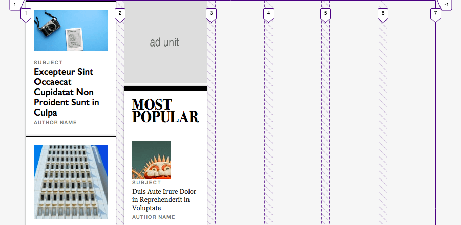
By default, no Grid layout is invoked on the page. Instead, content stacks vertically (Fig 2) in a single column according to its order in the HTML, just as it normally would. This is what phones and other narrow viewports will display (even your desktop browser if you make it narrow enough.)
The parent grid kicks in once the viewport is at least 56.25rem wide (Fig 3), switching us to the multi-column layout (Fig 4). That value typically translates to a minimum viewport width of 900px, because 56.25 x 16 = 900. I say “typically,” because 16 is usually a browser’s default font size, but the user can override it in their browser settings.
/* Prevent the page from getting too wide */
.WiredWrapper {
  max-width: 932px;
}

/* Switch to multi-column layout */
@media screen and (min-width: 56.25rem) {
  .WiredWrapper {
    display: grid;
    grid-gap: 16px;
    grid-template-columns: repeat(6, 1fr);
  }
}
I chose that minimum viewport width for the media query, because it’s the same as when Wired.com switches from a single-column layout to multiple columns. (CSS Grid didn’t exist when they built their homepage, so they use Flexbox to display multiple columns.)
And I went with six columns and a gap of 16px, because that’s what worked when I reverse-engineered Wired’s grid to match their widths and spacing between items. (Alternatively, you could use grid-template-columns: 2fr 1fr, which would be very close to their layout; off by only five or six pixels.)
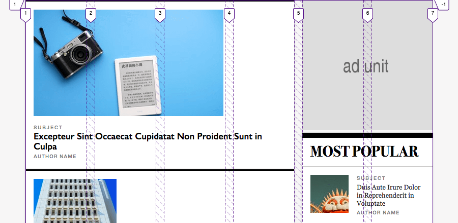
So we’ve defined the parent grid, which results in this layout:
It’s a step in the right direction: .Sidebar displays to the right of .Content, because they are the immediate children of the .WiredWrapper grid container, making them grid items.
However, they are squished into one column each. Let’s change that.
Placing the items on the parent grid and spanning more columns
We haven’t specified which columns .Content and .Sidebar should occupy, so Grid has auto-placed them in the first and second columns, respectively. It’s trivial to make them span more:
@media screen and (min-width: 56.25rem) {
  .Content {
    grid-column: span 4;
  }
  .Sidebar {
    grid-column: span 2;
  }
}
You’ll recall that .Content comes before .Sidebar in the HTML (Fig 1). Grid places each grid item in the first available column by default. And it does so per the item’s HTML source order. So we don’t have to tell it we want .Content to start in column 1, only how many columns it should occupy (4 in this case). Similarly, because column 5 is the first available column for .Sidebar after .Content is in place, we can just tell Grid to make it span 2 columns.
Fig 5 shows the result:
That’s more like it!
Alternatively, you could declare the start grid line values if you prefer to be explicit about where your items both start and end. This would also serve as a defensive coding approach if you’re worried about the HTML changing.
@media screen and (min-width: 56.25rem) {
  .Content {
    grid-column: 1 / span 4;
  }
  .Sidebar {
    grid-column: 5 / span 2;
  }
}
Either way, given our HTML, Fig 5 is the result. .Content and .Sidebar sit comfortably next to each other, with the former occupying twice as many columns.
Creating the Nested Grid
With the overall page layout finished, we can apply Grid to the cards inside .Content. This will allow us to arrange them nicely rather than let them continue to flow vertically, one after the other.
Each card represents a featured story, and Wired arranges them in a bento-box-like fashion. They reuse many of the card sizes and arrange them in various configurations throughout the homepage. I replicated only the top section of the page just to give you a sense of one way you can go about achieving such a layout.
Here’s the HTML in question. Please scroll in the box to view all of it:
<main class="Content">
  ...
    <div class="Cards">
      <div class="Card Card--standard">
        ...
      </div>

      <div class="Card Card--narrow">
        ...
      </div>

      <div class="Card Card--small-1 Card--horiz">
        ...
      </div>

      <div class="Card Card--large">
        ...
      </div>

      <div class="Card Card--small-2 Card--horiz-flipped">
        ...
      </div>

      <div class="Card Card--full Card--horiz">
        ...
      </div>
    </div>
  ...
</main>
As you’ll see in a bit, the .Card--standard, .Card--narrow, .Card--small-1, .Card--large, .Card--small-2, and .Card--full classes are the key to positioning each card on the grid.
Defining the nested grid
We used line-based positioning to place the parent grid’s items on that grid. But for the .Cards nested grid, we’ll use named grid areas in combination with the grid-template-areas property. I think this kind of layout is a good fit for this approach; I know it made it easier for me to place each card in the right spot. It also would make it easier to create an additional—but different—arrangement elsewhere on the page, should we want to.
Here’s our Grid definition:
@media screen and (min-width: 56.25rem) {
  .Cards {
    display: grid;
    grid-gap: 16px;
    grid-template-columns: repeat(6, 1fr);
    grid-template-areas:
      "standard standard standard standard narrow narrow"
      "small-1  small-1  small-1  large  large  large"
      "small-2  small-2  small-2  large  large  large"
      "full     full     full     full   full   full";
  }
}
The grid-template-areas value visually describes which grid areas should occupy which row(s) and columns. In other words, it shows how the bento box layout should look. In a moment, we’ll assign the corresponding grid area name to each card, snapping the cards into place. But until we do, Grid auto-places them across the six columns we just defined, creating a bit of a mess:
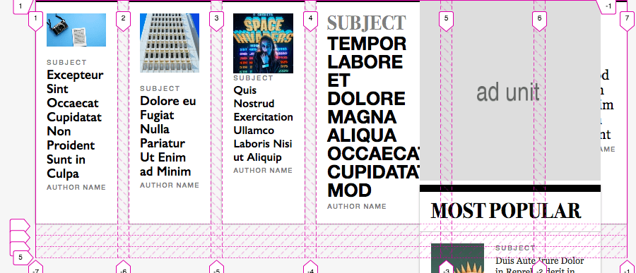
In Fig 5, we saw that <div class="Cards"> (as a child of <main class="Content">) fit neatly to the left of <div class="Sidebar">, as desired. But now it goes all the way across the page. Why?
It’s because of other styling on the cards themselves—like the author names being prevented from wrapping and the font sizes of the headlines—that makes the row too wide to fit when all of the cards display in the one row. .Content stretches to accommodate them.
Of course, we don’t want more than two cards per row, so this trouble will disappear when we explicitly place the cards. We’ll do so in the next step.
Naming the grid areas to complete placing the items on the grid
Finishing the layout is just a matter of assigning each card class with the appropriate grid-area name:
/* For reference, what we defined in Fig 6. */
.Cards {
  ...
  grid-template-areas:
    "standard standard standard standard narrow narrow"
    "small-1  small-1  small-1  large  large  large"
    "small-2  small-2  small-2  large  large  large"
    "full     full     full     full   full   full";
}

/* This part is new. Name each grid area used by grid-template-areas. */
.Card--standard { grid-area: standard; }
.Card--narrow { grid-area: narrow; }
.Card--small-1 { grid-area: small-1; }
.Card--small-2 { grid-area: small-2; }
.Card--large { grid-area: large; }
.Card--full { grid-area: full; }
As a result (Fig 8), the <div> with the .Card--standard class occupies columns 1–4 of row 1, .Card--narrow sits in columns 5–6 of row 1, .Card--small-1 fills columns 1–3 of row 2, and so on, just as shown in the grid-template-areas value.
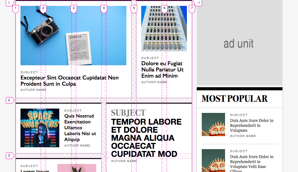
In Fig 8, I omitted the bottom of the screenshot for brevity, but the layout now matches the finished example shown after the intro at the top of this page!
If you still aren’t quite sure how the six columns of the .Cards grid fit in the four columns of .Content in the .WiredWrapper parent grid, know that the nested grid is completely unaware of how many columns the parent grid has, and vice versa. It just knows it sits in a container, which is .Content, the first grid item of .WiredWrapper.
Thanks ...
and see you next time!