Replicating a Boston Globe Layout with CSS Grid

The Boston Globe’s landmark redesign in 2011 ushered in the industry’s move to responsive web design. With CSS Grid poised to make a powerful impact of its own, it’s only appropriate that we take a look at how we could replicate one of the Globe’s layouts with Grid.
This style of article page appears throughout the Boston Globe’s Sports section. It’s bold, clean, and very easy to digest as a reader. An example is this article about Jaylen Brown of the Celtics, as shown in the screenshot above. (I also saw an instance that was similar—but not identical—in perhaps the Health section.)
Peruse the code, and then dive into the in-depth explanation of how it works.
The Finished Example Layout
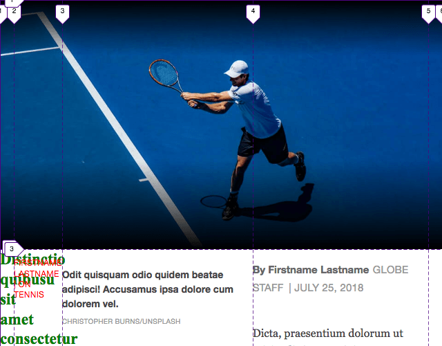
Distinctio quibusu sit amet consectetur adipisicing elit fugiat pariatur nostrum
Firstname Lastname | On Tennis
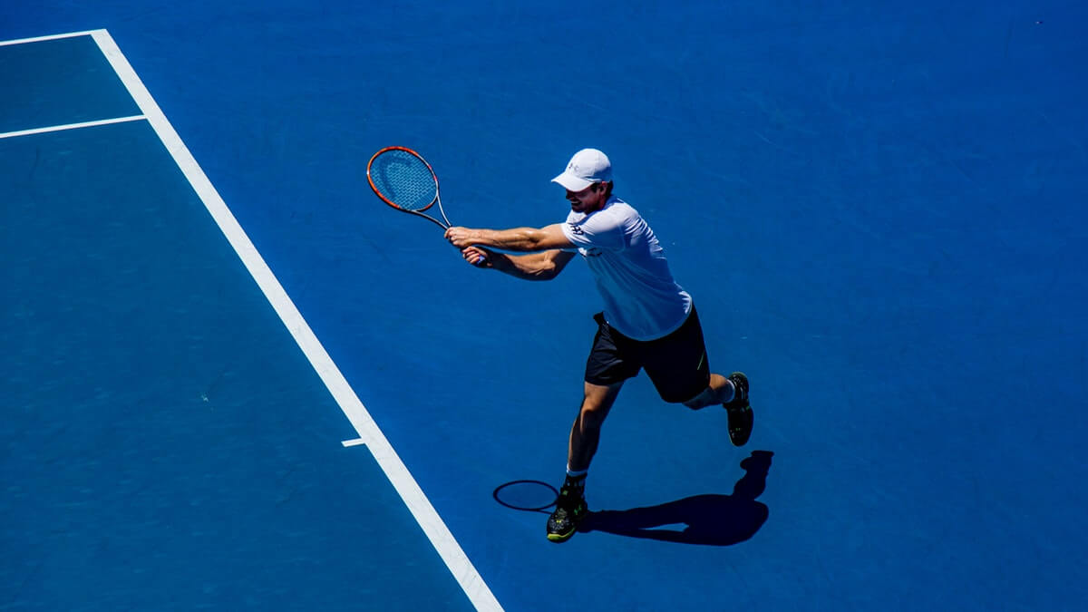
Odit quisquam odio quidem beatae adipisci! Accusamus ipsa dolore cum dolorem vel. Christopher Burns/Unsplash
Dicta, praesentium dolorum ut reiciendis iste suscipit porro, explicabo repellendus veniam ratione officia. Quasi voluptatum dicta reiciendis sed accusamus eos eius, veritatis.
Facilis quasi rem magni facere perferendis eaque praesentium consectetur quisquam dolorem sapiente atque dolorum labore illum delectus, cupiditate iusto qui, vitae ratione!
Quo provident explicabo a velit tenetur id, ad ducimus harum ipsa vitae cum laboriosam, facilis, quod assumenda quam voluptatum quidem adipisci qui. Error magni ratione temporibus impedit aut adipisci aliquid deserunt?
Nihil dolores aperiam porro labore facere obcaecati nulla dignissimos ea nisi. Labore aliquid alias voluptates tenetur atque dolor incidunt laborum eum itaque!
Firstname Lastname can be reached at firstname.lastname@example.com. Follow her on twitter at @example.The Code
HTML
<article class="Article">
  <h1 class="Article__headline">Distinctio quibusu sit amet consectetur adipisicing elit fugiat pariatur nostrum</h1>
  <p class="Article__subject">Firstname Lastname | On Tennis</p>

  <div class="Article__photo-wrap">
    <img
      srcset="
      img/tennis-375x211.jpg 375w,
      img/tennis-960x540.jpg 960w,
      img/tennis-1200x675.jpg 1200w,
      img/tennis-1920x1080.jpg 1920w"
      src="img/tennis-1200x675.jpg"
      sizes="100vw"
      class="Article__photo" alt="" aria-describedby="photo-caption">
  </div>

  <p id="photo-caption" class="Article__caption">
    <span class="Article__caption-text">Odit quisquam odio quidem beatae adipisci! Accusamus ipsa dolore cum dolorem vel.</span>
    <span class="Article__caption-credit">Christopher Burns/Unsplash</span>
  </p>

  <div class="Article__text">
    <p class="Byline">
      <span class="Byline__author">By Firstname Lastname</span> <span class="Byline__type">Globe Staff</span> <time class="Byline__date" datetime="2018-07-25">July 25, 2018</time>
    </p>

    <p>Dicta, praesentium dolorum ut reiciendis iste suscipit porro, explicabo repellendus veniam ratione officia. Quasi voluptatum dicta reiciendis sed accusamus eos eius, veritatis.</p>

    <p>Facilis quasi rem magni facere perferendis eaque praesentium consectetur quisquam dolorem sapiente atque dolorum labore illum delectus, cupiditate iusto qui, vitae ratione!</p>

    <p>Quo provident explicabo a velit tenetur id, ad ducimus harum ipsa vitae cum laboriosam, facilis, quod assumenda quam voluptatum quidem adipisci qui. Error magni ratione temporibus impedit aut adipisci aliquid deserunt?</p>

    <p>Nihil dolores aperiam porro labore facere obcaecati nulla dignissimos ea nisi. Labore aliquid alias voluptates tenetur atque dolor incidunt laborum eum itaque!</p>

    <address>Firstname Lastname can be reached at <a href="mailto:firstname.lastname@example.com">firstname.lastname@example.com</a>. Follow her on twitter at @example.</address>
  </div>
</article>
CSS
body {
  margin: 0;
}

/* Grid
-------------------------------------- */
/* Define the grid */
.Article {
  display: grid;
  grid-template-columns: 20px 1fr minmax(250px, 700px) 1fr 20px;
  grid-template-rows: 1fr repeat(3, auto);
}

@media screen and (min-width: 48.0625rem) {
  .Article {
    grid-template-columns: 28px 1fr minmax(500px, 700px) 1fr 28px;
  }
}

@media screen and (min-width: 64rem) {
  .Article {
    grid-column-gap: 28px;
    grid-template-columns: 22px 1fr 61.5% 1fr 1px;
    grid-template-rows: 1fr auto auto;
  }
}

@media screen and (min-width: 71.1875rem) {
  .Article {
    grid-template-columns: 22px 1fr minmax(500px, 700px) 1fr 22px;
  }
}

/* Place items on the grid */
.Article__headline, .Article__subject {
  grid-column: 2 / span 3;
  z-index: 2;
}

.Article__headline {
  grid-row: 2;
}

.Article__subject {
  align-self: end;
  grid-row: 1;
}

.Article__photo-wrap {
  grid-column: 1 / -1;
  grid-row: 1 / span 2;
}

.Article__caption {
  grid-column: 3;
  grid-row: 3;
}

.Article__text {
  grid-column: 3;
  grid-row: 4;
}

@media screen and (min-width: 64rem) {
  .Article__caption {
    grid-column: 4;
  }
  .Article__text {
    grid-row: 3;
  }
}

/* Styling
-------------------------------------- */
.Article__caption,
.Article__subject,
.Byline {
  font-family: "Helvetica Neue", Helvetica, Arial, sans-serif;
}

.Article {
  color: #464646;
  font-family: Georgia, "Times New Roman", Times, serif;
}

.Article__headline {
  color: #fff;
  font-family: "Times New Roman", Times, serif;
  font-size: 1.4375rem;
  line-height: 1.25;
  margin-bottom: 20px;
  margin-top: 0;
}

@media screen and (min-width: 48.0625rem) {
  .Article__headline {
    font-size: 2.125rem;
    line-height: 1.2;
  }
}

@media screen and (min-width: 64rem) {
  .Article__headline {
    font-size: 4.75rem;
  }
}

.Article__subject {
  color: #fff;
  font-size: 0.75rem;
  letter-spacing: 0.025em;
  margin-bottom: 1px;
  text-transform: uppercase;
}

@media screen and (min-width: 48.0625rem) {
  .Article__subject {
    font-size: 0.875rem;
    margin-bottom: 0;
  }
}

@media screen and (min-width: 64rem) {
  .Article__subject {
    font-size: 0.875rem;
    margin-bottom: 25px;
  }
}

.Article__photo-wrap {
  max-height: 90vh;
  overflow: hidden;
  position: relative;
}

.Article__photo-wrap:after, .Article__photo-wrap:before {
  content: ' ';
  position: absolute;
  width: 100%;
  z-index: 1;
}

.Article__photo-wrap:after {
  background-image: linear-gradient(to bottom, transparent 0%, rgba(0, 0, 0, 0.5) 50%, black 100%);
  height: 20vw;
  bottom: 0;
}

@media screen and (min-width: 64rem) {
  .Article__photo-wrap:after {
    height: 35vw;
    max-height: 330px;
  }
}

.Article__photo-wrap:before {
  background-image: linear-gradient(to bottom, black 0%, rgba(0, 0, 0, 0.5) 50%, transparent 100%);
  height: 80px;
  top: 0;
}

.Article__photo {
  width: 100%;
  display: block;
}

.Article__caption {
  margin-top: 26px;
}

@media screen and (min-width: 64rem) {
  .Article__caption {
    margin-top: 74px;
    width: 150px;
  }
}

.Article__caption-text {
  font-size: 0.875rem;
  font-weight: bold;
  line-height: 1.412;
}

@media screen and (min-width: 64rem) {
  .Article__caption-text {
    font-size: 0.9375rem;
  }
}

.Article__caption-credit {
  color: #9b9b9b;
  display: block;
  font-size: 0.625rem;
  letter-spacing: 0.03em;
  line-height: 2.1667;
  margin-top: 4px;
  text-transform: uppercase;
}

@media screen and (min-width: 64rem) {
  .Article__caption-credit {
    font-size: 0.75rem;
    margin-top: 0;
  }
}

.Article__text p {
  margin-bottom: 30px;
  font-size: 1rem;
}

@media screen and (min-width: 48.0625rem) {
  .Article__text p {
    font-size: 1.3125rem;
  }
}

.Article__text p:not(.Byline) {
  line-height: 1.6;
}

.Article__text address {
  font-size: 1rem;
  margin-bottom: 30px;
}

.Article__text a {
  color: #000;
  text-decoration: none;
}

.Byline {
  line-height: 1.1;
  padding-bottom: 10px;
}

@media screen and (min-width: 48.0625rem) {
  .Byline {
    margin-top: 15px;
  }
}

@media screen and (min-width: 64rem) {
  .Byline {
    margin-top: 25px;
  }
}

.Byline > * {
  font-size: 0.9375rem;
  line-height: 1.75;
}

.Byline__author {
  color: #666;
  display: inline-block;
  font-weight: 700;
  margin-right: 1px;
}

.Byline__type, .Byline__date {
  color: #9b9b9b;
  letter-spacing: 0.015em;
  text-transform: uppercase;
}

.Byline__type:after {
  content: '|';
  display: inline-block;
  margin-left: 7.5px;
}
How Does It Work?
This seemingly simple layout has a few particularly interesting things going on under the hood. In this breakdown, I’ll focus on:
- setting up the grid across breakpoints;
- achieving the text-over-image effect by layering grid items;
- moving the photo caption from underneath the photo to the right column at a certain breakpoint;
- using a responsive
imginstead of a CSS background image;
That’s quite a bit to cover, so let’s dig in.
Setting up the grid across breakpoints
I used the same breakpoints as the Boston Globe in an effort to mimic their layout as closely as possible.
The page has two main layout configurations: the Fig 1 default (Fig 1 and Fig 2) with the photo caption directly beneath the photo, and one with it off to the right in its own column when the viewport gets much wider (Fig 10).
Other things—like font sizes and the article’s text column width—change at various breakpoints, but in terms of what shows where, the difference comes down to the photo caption’s placement.
The default grid is defined with the following:
.Article {
  display: grid;
  grid-template-columns: 20px 1fr minmax(250px, 700px) 1fr 20px;
  grid-template-rows: 1fr repeat(3, auto);
}
I’ll focus on the columns for now, and get into the rows in the next two sections.
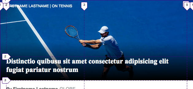
You might be wondering why I’ve defined five columns when it appears there are only three (Fig 2): the gutters on the left and right, and the content in the middle.
The reason becomes apparent when the page is viewed a little wider (Fig 3). At that point, all of the text below the image deliberately begins to shift to the right, no longer aligning with the left edge of the text on the image.
How is this done? The 1fr width of columns 2 and 4. Remember, 1fr means one fraction of the available space. The available space is determined by the width of the columns that are not defined with a fr unit, relative to the container holding our entire layout. (If a grid-column-gap were specified, it would also affect the available space.)
Looking back at our initial grid-template-columns value in Fig 1, we see that the widths of the other columns are 20px (left gutter) + a maximum of 700px (primary content area) + 20px (right gutter) for a total of 740px.
The container for our layout is an <article> element that streches the full width of <body> and doesn’t have any padding. This means there is no available space until the viewport is at least 741px wide, at which point it is divided evenly among columns 2 and 4 (Fig 3).
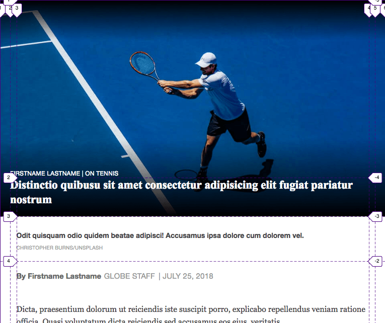
The text sitting on the image doesn’t indent like the other text, because it is told elsewhere to occupy columns 2–4 (via grid-column: 2 / span 3) rather than only column 3. (Quick interjection: this is getting ahead of ourselves a bit. I’ll discuss more about placing the items on the grid in the next section.)
Now you might be wondering why I didn’t make the default grid be three columns instead of five, and then switch to five columns at a min-width of 741px when those extra two columns actually impact the layout. Well, it turns out that every other breakpoint also uses a five-column grid, which means I mostly only have to declare once which columns the various bits of content should sit in. The lone exception is the photo caption, which we’ve already established will move to its own column at a wider breakpoint.
Achieving the text-over-image effect
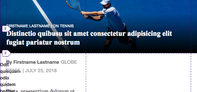
So far all we’ve really done in this breakdown is define the grid’s rows and columns (Fig 1). We haven’t placed the content where we want to on the grid. So if you were to view the page, you’d see some variation of the horrible—but expected—mess shown in Fig 4.
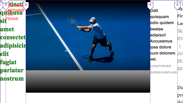
Grid has auto-placed the first grid item in column 1, the second in column 2, and so on. In the case of each of the two 20px gutter columns, the content is too wide to fit, so it spills out of (or overflows) its column.
Placing the image
Let’s begin to impose some order on our layout, beginning with the wrapper around the image. It has a wrapper so we can apply a top and bottom gradient over the image with ::before and ::after. The top gradient looks good, but the bottom one can currently be seen in all its garish gray glory below the image.
Our end goal is to superimpose the article headline and subject text on the image, which we can do because Grid allows you to place more than one grid item in the same row(s) and/or column(s).
First, the image:
.Article__photo-wrap {
  grid-column: 1 / -1;
  grid-row: 1 / span 2;
}

/*
One of the other ways to achieve the same result:
grid-column: 1 / 6; (i.e., "start at column grid line 1 and end at 6")
grid-row: 1 / 3; (i.e., "start at row grid line 1 and end at 3")
*/
With this set, the image covers the first two rows and spans across our entire grid, giving us the full-bleed effect we wanted (Fig 5). (Please see the Features Unit discussion for more about using -1.)
Placing the text on the image
Now let’s tackle the headline and subject together:
HTML
<h1 class="Article__headline">
  Distinctio quibusu sit amet consectetur adipisicing elit fugiat pariatur nostrum
</h1>

<p class="Article__subject">
  Firstname Lastname | On Tennis
</p>
CSS
.Article__headline,
.Article__subject {
  grid-column: 2 / span 3;
  z-index: 2;
}

.Article__headline {
  grid-row: 2;
}

.Article__subject {
  grid-row: 1;
}
Note that the headline comes before the subject in the HTML (Fig 6), but displays after it (Fig 7). I thought that approach was preferable semantically, as I considered the subject to be ancillary information rather than a top-level heading for the headline to live under. (We absolutely want our headline to be an <h1> for both accessibility and SEO purposes.) The Globe also treats the subject—which they call the “overline” in one of their classes—with secondary importance.
Flipping the display order is just a matter of placing the subject in row 1 and the headline in row 2. (It’s OK in this case, but please see the O-in-O pattern for why you should be careful about changing the display order.)
Making the text sit low
Looking at Fig 7, why is row 1 so much taller than row 2? First it helps to understand that the combined heights of these rows is dictated by the image, because it occupies the same rows as the subject and headline and is taller than either of them. With that in mind, recall how we defined these rows in Fig 1: we set row 1 to 1fr and row 2 to auto. With auto, row 2’s height is determined by the height of its contents, the headline. And because row 1 is 1fr, we know its height is the remaining available space.
.Article__subject {
  ...
  align-self: end;
}
But the subject is sitting up top. We want it to sit at the bottom of its row, so it’s just above the headline. Fortunately, this is as simple as applying align-self: end, as shown in Fig 8.
Making the text visible
All of this would have been for naught if we hadn’t set z-index: 2 on the headline and subject in Fig 6. Without that, the image would cover the text, because its wrapper comes after the headline and subject in the HTML source, and it occupies some of the same rows and columns as them. The top and bottom gradients have z-index: 1 to sit between the image and text.
Lastly, I started the text in column 2 so the 20px width of the first and last columns prevents it from hitting the viewport’s edges.
Placing the photo caption and article text
We’re almost done. We only have to position the photo caption and the article text. Let’s tackle them together as well:
.Article__caption {
  grid-column: 3;
  grid-row: 3;
}

.Article__text {
  grid-column: 3;
  grid-row: 4;
}
Those two rules give us Fig 9, which is the same as Fig 2 and, when a little wider, Fig 3.
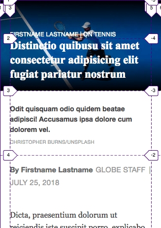
Our last main bit is to move the caption to its own column to the right of the article text when the viewport gets pretty wide. (In the media query below, 64rem = 1024px unless the user has changed the default font size in their browser.) This requires slightly altering our grid definition.
As we’ve already covered, the default layout has four rows. The caption sits in row 3 above the article text in row 4 (Fig 9). But in viewports at least 1024px wide, they will both occupy row 3—just in different columns—so we only need three rows (Fig 10).
All of this is achieved with a few simple lines:
@media screen and (min-width: 64rem) {
  .Article {
    ...
    grid-column-gap: 28px;
    grid-template-rows: 1fr auto auto; /* switch to 3 rows */
  }

  .Article__caption {
    grid-column: 4;
  }

  .Article__text {
    grid-row: 3;
  }
}
Other Stuff
What else? If you look back at the complete CSS, you’ll see I have some additional media queries. They don’t change the layout configuration, but just alter the gutter and content column widths at various breakpoints in keeping with the Boston Globe’s layout.
That’s it for the layout breakdown! Once you understand some of the techniques, it’s simpler to implement than the length of this explanation might suggest.
I’ll close by discussing a question that some of you might have, namely ...
Why not use a CSS background image instead?
It’s true that we wouldn’t have to layer the grid items if the image were a CSS background-image instead of an HTML <img>. But the image isn’t decorative, it’s part of the article’s content just as much as the text is. So, semantically, it’s best to mark it up with <img>. It just happens to have text on it, perhaps making it seem like a background image. Additionally, foreground images may be picked up by search engines, if that is of interest to you.
By using <img> in combination with the srcset and sizes properties, the browser can load the image asset it thinks is the most appropriate while taking various criteria into account. Consequently, a user viewing the page on, say, a phone wouldn’t have to load the same huge image that a desktop user would. The Boston Globe also implemented it as a responsive image, albeit with more srcset values. (If srcset and sizes are new to you, Jason Grigsby has you covered in his Responsive Images 101 Series.)
Thanks ...
and see you next time!