Feature on Top, with Content (Grid)
This is a practical implementation of the generic Feature on Top, showing you how it could look with content added. The result is a pattern commonly seen on the web. It also contains an example of nesting one Grid inside another one. In this case, the nested Grid facilitates making the large image and its headline occupy the same cell so the text can overlay the image—look for the .Story--feature CSS.
For a similar text-over-image effect but with an approach that doesn’t use a nested Grid, please see the detailed “How Does It Work?” section of “Replicating a Boston Globe Layout with CSS Grid.”
The Finished Example Layout
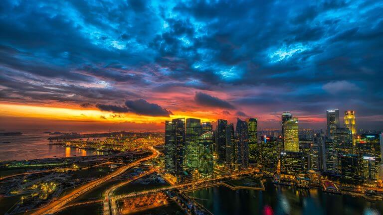


Images courtesy of Unsplash
The Code
HTML
<div class="Stories">
  <div class="Story Story--feature">
    <img src="img/city.jpg" alt="" class="Story__img Story__img--feature">
    <p class="Story__title Story__title--feature"><a href="#">Ab quo a eaque dignissimos, minima impedit distinctio culpa, expedita ullam tenetur fugit odit totam.</a></p>
  </div>

  <div class="Story">
    <img src="img/ocean-town.jpg" alt="" class="Story__img">
    <p class="Story__title"><a href="#">Lorem ipsum dolor sit amet.</a></p>
  </div>

  <div class="Story">
    <img src="img/massey-hall.jpg" alt="" class="Story__img">
    <p class="Story__title"><a href="#">Dolores ad quos atque dolorem cupiditate, rush asperiores assumenda neque.</a></p>
  </div>

  <div class="Story">
    <img src="img/ocean-city.jpg" alt="" class="Story__img">
    <p class="Story__title"><a href="#">Eos eaque odio, ullam quod! Dolorem quasi ea aspernatur.</a></p>
  </div>
</div>

<p class="Credit">Images courtesy of <a href="https://unsplash.com/">Unsplash</a></p>
CSS
/* Grid Container
-------------------------------------- */
.Stories {
  font-family: Georgia, "Times New Roman", Times, serif;
  margin-left: auto;
  margin-right: auto;
  max-width: 768px;
  /* Note that the layout is vertical by default. The grid isn't applied to .Stories until a wider breakpoint (see next rule). */
}

@media screen and (min-width: 30em) {
  .Stories {
    /* Define the grid */
    display: grid;
    grid-gap: 10px;
    grid-template-columns: repeat(3, 1fr);
  }
}

/* Grid Items Plus Their Content
-------------------------------------- */
.Story {
  margin-left: auto;
  margin-right: auto;
  max-width: 256px;
}

@media screen and (max-width: 29.9375em) {
  .Story {
    margin-bottom: 20px;
  }
}

.Story--feature {
  max-width: 768px;
  /* define the nested grid */
  display: grid;
}

@media screen and (min-width: 30em) {
  .Story--feature {
    /* this determines its placement on the PARENT grid
      (of which .Stories is the container), not the nested one
      (of which .Story--feature itself is the container). */
    grid-column-end: span 3;
  }
}

.Story__title--feature, .Story__img--feature {
  /* place on nested grid */
  grid-column: 1;
  grid-row: 1;
}

.Story__title {
  margin-bottom: 0;
  margin-top: 10px;
  padding-left: 20px;
  padding-right: 20px;
}

@media screen and (min-width: 30em) {
  .Story__title {
    margin-top: 15px;
  }
}

.Story__title--feature {
  background-color: rgba(0, 0, 0, 0.6);
  line-height: 1.23;
  padding-bottom: 13px;
  padding-top: 13px;
  /* superimpose text on feature image. this works because .Story--feature is a grid container. */
  align-self: end;
  z-index: 1;
}

@media screen and (min-width: 30em) {
  .Story__title--feature {
    font-size: 1.5625rem;
    padding-bottom: 20px;
    padding-top: 20px;
  }
}

.Story__img {
  border: 1px solid #777;
  display: block;
  max-width: 100%;
}

/* Text links */
.Story a {
  color: #222;
  display: block;
  text-decoration: none;
}

.Story a:hover {
  text-decoration: underline;
}

.Story--feature a {
  color: #fff;
}

/* Photos credit below container
----------------------------------- */
.Credit {
  font-style: italic;
  margin-left: auto;
  margin-right: auto;
  max-width: 768px;
  padding-right: 20px;
  text-align: right;
}