Replicating a Netflix Homepage Module with CSS Grid

Under certain conditions, Netflix's Homepage displays this component, which details that the service can be watched on a wide range of devices. Learn how to re-create it by using Grid.
This makeover has three layout configurations—depending on the viewport size—all controlled by Grid. As part of this, it provides a chance to show how to use Grid’s display reordering powers sensibly and responsibly. I explain how it all works following the example and its code.
Netflix used inline-block to display columns in their version (shown in the screenshot above). There are still use cases for inline-block—I use it for the button in this example—but not so much when creating layouts now that we have Flexbox, Grid, and Multi-column Layout. Plus, with these newer methods, you won’t have to introduce workarounds to counteract white space.
This is not to be critical of Netflix; they likely used what was available to them at the time or what would ensure the very widest browser support given their broad audience. And more than anything, this makeover is an opportunity to demonstrate an alternate approach, free of any possible constraints.
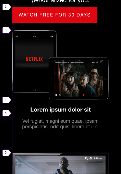
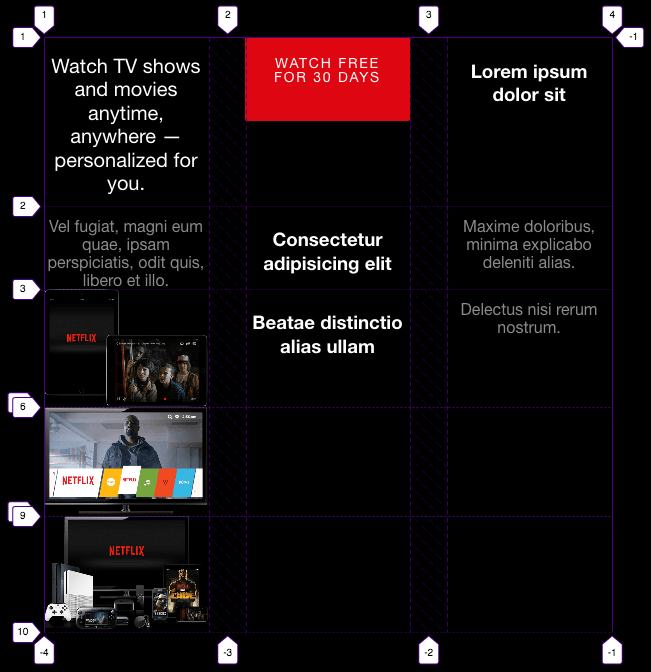
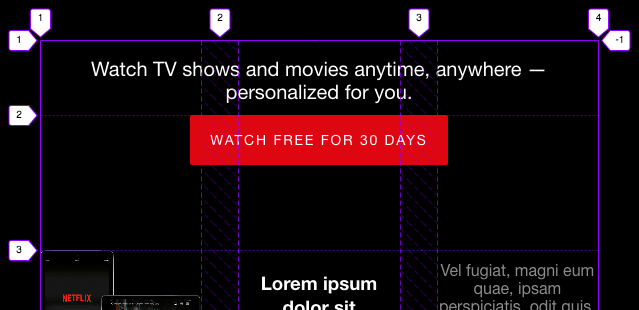
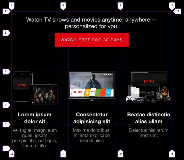
The Finished Example Layout
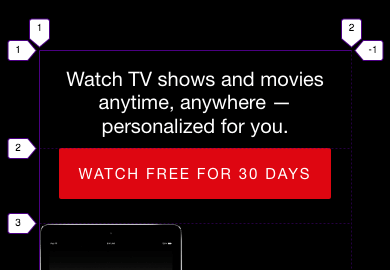
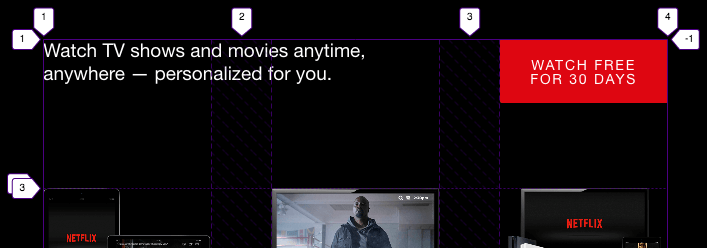
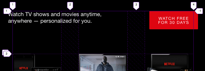
Watch TV shows and movies anytime, anywhere — personalized for you.
Watch free for 30 daysLorem ipsum dolor sit
Vel fugiat, magni eum quae, ipsam perspiciatis, odit quis, libero et illo.
Consectetur adipisicing elit
Maxime doloribus, minima explicabo deleniti alias.
Beatae distinctio alias ullam
Delectus nisi rerum nostrum.
Images are from Netflix’s Media Center/Company Assets page.
The Code
HTML
<!--
* In practice, I would add classes to the content in the <section>, and use them as styling hooks. But for this demo I decided to keep the HTML clean so it would be obvious to you that no wrapper (such as a div) is required around each feature to make it display in its own column.
* I used an <h2> and <h3> hierarchy figuring that a module like this would be on a page that has an <h1> it should live under.
-->
<div class="netflixContainer">
<section class="netflix">
<h2>Watch TV shows and movies anytime, anywhere — personalized for you.</h2>
<a href="#">Watch free for 30 days</a>
<!-- Feature 1 -->
<h3>Lorem ipsum dolor sit</h3>
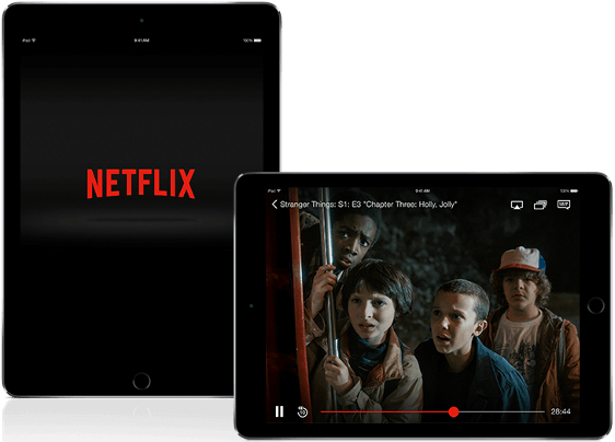
<img src="img/netflix-ipad.png" alt="Two iPads displaying Netflix." />
<p>Vel fugiat, magni eum quae, ipsam perspiciatis, odit quis, libero et illo.</p>
<!-- Feature 2 -->
<h3>Consectetur adipisicing elit</h3>
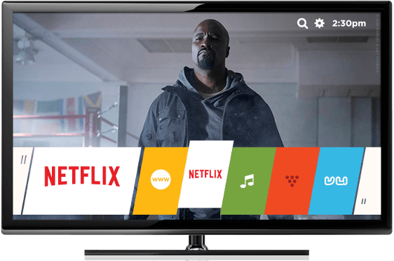
<img src="img/netflix-tv.png" alt="A TV displaying Netflix." />
<p>Maxime doloribus, minima explicabo deleniti alias.</p>
<!-- Feature 3 -->
<h3>Beatae distinctio alias ullam</h3>
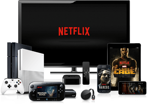
<img src="img/netflix-multi-devices.png" alt="A phone, tablet, TV, and game devices displaying Netflix." />
<p>Delectus nisi rerum nostrum.</p>
</section>
</div>
<p class="Credit Credit--rt">Images are from <a href="https://media.netflix.com/en/company-assets" rel="external">Netflix’s Media Center/Company Assets</a> page.</p>
CSS
* {
  box-sizing: border-box;
}

body {
  margin: 0;
}

/* CONTAINER OF WHOLE MODULE
-------------------------------- */
.netflixContainer {
  background-color: #000;
}

/* GRID
-------------------------------------- */
/* Define the default grid (narrowest viewports) */
.netflix {
  display: grid;
}

/* Place the images on the grid. All other items are auto-placed. */
.netflix img:nth-of-type(1) {
  grid-row: 3;
}

.netflix img:nth-of-type(2) {
  grid-row: 6;
}

.netflix img:nth-of-type(3) {
  grid-row: 9;
}

/* Center these horizontally */
.netflix a {
  justify-self: center;
}

/* Switch to three-column grid */
@media (min-width: 56.3125rem) {
  .netflix {
    /* Define the grid */
    grid-template-columns: repeat(3, 1fr);
    grid-column-gap: 37px;
  }
  /* Place items on the grid */
  .netflix a,
  .netflix h2 {
    grid-column: 1 / span 3;
  }
  .netflix img:nth-of-type(1n) {
    grid-row: 3;
  }
  .netflix h3 {
    grid-row: 4;
  }
  .netflix p {
    grid-row: 5;
  }
}

/* Adjust grid to move link (button) next to module heading */
@media (min-width: 61.9375rem) {
  .netflix {
    grid-column-gap: 60px;
  }
  .netflix h2 {
    grid-column: 1 / span 2;
  }
  .netflix a {
    grid-column: 3;
    justify-self: end;
  }
}

/* STYLING
-------------------------------------- */
.netflix {
  color: #fff;
  font-family: "Helvetica Neue", Helvetica, Arial, sans-serif;
  line-height: 1;
  margin-left: auto;
  margin-right: auto;
  padding-bottom: 80px;
  padding-top: 50px;
  text-align: center;
  width: 80%;
  -moz-osx-font-smoothing: grayscale;
  -webkit-font-smoothing: antialiased;
}

@media (min-width: 33.8125rem) {
  .netflix {
    width: 63%;
  }
}

@media (min-width: 56.3125rem) {
  .netflix {
    padding-bottom: 73px;
    padding-top: 70px;
  }
}

.netflix h2 {
  font-size: 1.25rem;
  font-weight: normal;
  line-height: 1.175;
  margin-bottom: 11px;
}

@media (min-width: 61.9375rem) {
  .netflix h2 {
    font-size: 1.1875rem;
    margin-top: 0;
    text-align: left;
    transform: translateX(-15px);
  }
}

@media (min-width: 81rem) {
  .netflix h2 {
    font-size: 1.375rem;
  }
}

@media (min-width: 93.8125rem) {
  .netflix h2 {
    font-size: 1.625rem;
  }
}

@media (min-width: 108.1875rem) {
  .netflix h2 {
    font-size: 1.875rem;
  }
}

.netflix h3 {
  font-size: 1.16979rem;
  line-height: 1.25;
}

@media (min-width: 33.8125rem) {
  .netflix h3 {
    margin-top: 1.375rem;
  }
}

.netflix a {
  background-color: #de0611;
  border-radius: 2px;
  color: #fff;
  display: inline-block;
  font-size: 0.9375rem;
  letter-spacing: .125em;
  margin-bottom: 1.5rem;
  max-width: 17.1875rem;
  padding: 18px 20px;
  text-decoration: none;
  text-transform: uppercase;
}

@media (min-width: 33.8125rem) {
  .netflix a {
    margin-bottom: 4.125rem;
  }
}

@media (min-width: 43.8125rem) {
  .netflix a {
    font-size: 0.875rem;
  }
}

@media (min-width: 56.3125rem) {
  .netflix a {
    margin-bottom: 5.3125rem;
    max-width: 16.25rem;
  }
}

@media (min-width: 61.9375rem) {
  .netflix a {
    transform: translateX(15px);
  }
}

.netflix p {
  color: #8b8b8b;
  line-height: 1.125;
  margin-bottom: 4.6875rem;
}

.netflix p:last-of-type {
  margin-bottom: 0;
}

@media (min-width: 56.3125rem) {
  .netflix p {
    margin-bottom: 0;
    margin-top: 0.6875em;
  }
}

.netflix img {
  max-width: 100%;
}

/* For browsers that don't support grid */
.netflix {
  max-width: 540px;
}

.netflix h3 {
  margin-bottom: .75em;
}

/* Undo what was set for browsers that don't support grid */
@supports (display: grid) {
  .netflix {
    max-width: initial;
  }
  .netflix h3 {
    margin-bottom: 0;
  }
}
How Does It Work?
In this breakdown we’ll cover:
- the HTML wrappers;
- achieving the three layouts—
- swapping the order of the
<img>and<h3>elements (and why); - and the convenience of a collapsing row.
The HTML Wrappers
Before I explain how the layout works, take a gander at the HTML to become familiar with its structure. In particular, note that there are only two wrappers. They are:
<div class="netflixContainer">...</div><div class="netflix">...</div>
Moving forward, I’ll refer to them as .netflixContainer and .netflix, respectively.
The .netflixContainer wrapper has only one purpose: to display the black background across the full width of the page, no matter how wide the viewport.
Meanwhile, .netflix is the Grid container, and it is centered horizontally within .netflixContainer. It’s width value (80% or 63% depending on the viewport size) prevents it from becoming as wide as its parent. With the width set, the centering is achieved by setting it’s left and right margins to auto.
What about individual column wrappers—won’t we need those? Nope! Thanks to Grid, we can keep our HTML tidy and semantically rich, and still achieve this multi-column layout.
Let’s find out how.
Note: Please see the comment at the beginning of the HTML about why I largely eschewed classes for this example, and why I used <h2> and <h3> instead of <h1> and <h2>.
The Single-Column Layout
In keeping with mobile-first principles, we’ll start with the narrowest layout and work our way up.
We begin by declaring our grid:
.netflix {
  display: grid;
  /*
  I could explicitly declare it a one-column grid, but it isn’t required.
  grid-template-columns: 1fr;
  */
}
Placing the images before their subheads
<!-- Feature 1 -->
<h3>...</h3>
<img src="img/netflix-ipad.png" alt="..." />
<p>...</p>
<h3> comes before the <img> but will display after it once we apply more CSS.Typically I wouldn’t use Grid for a single-column layout—I’d just let the content flow vertically naturally. But in this case, I wanted to improve the HTML source order (Fig 2) a bit by having each <h3> come before its corresponding <img> (to specify that the image falls under the subhead semantically) while displaying after it.
This is possible because Grid makes it trivial to reorder content. I think it’s OK to reorder content in this case, however, don’t abuse this power—it can introduce accessibility issues. (The O-in-O pattern has more about this.)
But we haven’t reordered those items yet, so currently the content is in the same order as its HTML source. Specifically, each child of .netflix is now a grid item, occupying a row each by default:
<img> before its <h3>, as viewed with Firefox’s Grid Inspector enabled.Note that I did not specify the number of rows (or columns, for that matter) in Fig 1. I could have stated grid-template-rows: 11 (for one row per child of .netflix) to define the rows explicitly, but in absence of that, Grid auto-places them for us in the same manner.
A quick side note: I’ve set vertical margins on some of the items elsewhere in the CSS, so that’s why Fig 3 shows extra space between the red button and the first heading, and below the text that sits in row 5.
Now we’re ready to reorder each image:
.netflix img:nth-of-type(1) {
  grid-row: 3; /* was in row 4 */
}

.netflix img:nth-of-type(2) {
  grid-row: 6; /* was in row 7 */
}

.netflix img:nth-of-type(3) {
  grid-row: 9; /* was in row 10 */
}
This places each image in the row that its corresponding <h3> occupied in Fig 3. By doing so, Grid now auto-places each of those headings in the next available row, which is the one formerly occupied by its <img>. In other words, the headings and images swap rows on the grid:
<img> explicitly placed in the row before its <h3>.Centering the button (the link)
The last thing we need to do is center the <a> button horizontally. The text in the button—as well as other text on the page—is already centered via text-align: center, but the button itself is flush-left (Fig 4).
We can center it horizontally in its grid cell:
.netflix a {
  justify-self: center;
}
That gives us this:
<a> button is centered, just like the text above and (not shown) below it.That completes the single-column layout!
Switching to the Three-Column Layout
@media (min-width: 56.3125rem) {
  .netflix {
    grid-template-columns: repeat(3, 1fr);
    grid-column-gap: 37px;
  }
}
Netflix switches the features to three columns when the viewport is at least 901px wide, so I made my version do the same. (I used the rem unit type instead of px in the media queries.) I’ll break it down over a few steps.
First, we redefine our grid so it has three columns of equal width with a little gap between each (Fig 6).
That yields a bit of a mess because we haven’t said where the items should go except for the images, which we placed in rows three, six, and nine earlier. So Grid auto-places the remaining items—one by one—across row one until it runs out of columns, and then it continues in the second row, and so on.
Fortunately, it’ll only take a few lines to clean it up. We’ll begin by making the module’s main heading and button span three columns each:
@media (min-width: 56.3125rem) {
  ...
  .netflix a,
  .netflix h2 {
    grid-column: 1 / span 3;
    /* Any of these would also work:
        grid-column: 1 / -1;
        grid-column: span 3;
        grid-column-end: span 3;
    */
  }
}
As with earlier, the space below the button is coming from a margin-bottom setting made elsewhere in the CSS.
All that remains is to place the images, subheads, and blurb paragraphs in consecutive rows:
@media (min-width: 56.3125rem) {
  ...
  .netflix img:nth-of-type(1n) {
    /* Although we’re assigning the same row to
    all imgs, :nth-of-type is required to match
    the specificity of when we reorderd the imgs. */
    grid-row: 3;
  }

  .netflix h3 {
    grid-row: 4;
  }

  .netflix p {
    grid-row: 5;
  }
}
I’ve been leveraging Grid’s auto-placement algorithm extensively for this makeover, and it was especially handy here. Nine CSS rules instead of three would have been required if we had to explictly place each item in a row-and-column slot. Instead, because’s Grid default behavior for auto-placement is to run horizontally, it automatically placed each <img>, <h3>, and <p> across the rows we specified.
Here is the result:
Modifying the Three-Column Layout
When the page is a little wider, the layout changes one more time. The main difference is a slight variation on the previous layout: the main heading and button share the same row. (The grid-column-gap also increases, but that isn’t as noteworthy.)
The heading, which previously spanned three columns, needs to span two to make room for the button. Then we can place the button next to it. As in Fig 8, there are a few ways to achieve the same result, but I’ve opted again for the slightly longer syntax below for clarity:
@media (min-width: 61.9375rem) {
  .netflix h2 {
    grid-column: 1 / span 2;
  }

  .netflix a {
    /* spans 1 column by default */
    grid-column: 3;
  }
}
Again due to Grid’s auto-placement, we didn’t have to specify grid-row: 1 for them (but we could for the same result). As expected, they’re both in row one now:
The convenience of a collapsing row
If you look closely at Fig 10, you might wonder what happened to row two. After all, the grid line markers that Firefox’s Grid Inspector shows on the left side jump from “1” to “3.”
Here’s what’s going on. Remember, we told Grid to place the images in row three, the subheads in row four, and the paragraphs in row five. With the button in row one now, there is no content for row two, so Grid collapses it. If you look even closer at Fig 10, you can see what appears to be another grid line marker behind the “3” on the left. That’s the obscured “2” marker. (And once again, the space below the button is from a margin, not row two.)
To be clear, though, if at some point we had defined a height for row two, it would take up that defined space even if the row didn’t have any content—but we never gave row two a height.
In our case, it’s really convenient of Grid to essentially ignore row two because it saves us the trouble of having to reposition the items from rows 3–5 to rows 2–4 after moving the button to row one.
One final tweak
Lastly, we want the heading and button to stick outside the edges just a bit. There are a few ways we can do this. Here’s one:
@media (min-width: 61.9375rem) {
  ...

  .netflix h2 {
    ...
    transform: translateX(-15px);
  }

  .netflix a {
    ...
    justify-self: end;
    transform: translateX(15px);
  }
}
Finis!
And that completes this makeover. Thanks, and see you next time!