Media Object
When Nicole Sullivan heralded the notion of Object Oriented CSS (OOCSS)—in 2009, ages before Flexbox or Grid—the media object, as she dubbed it, was a central design pattern. Philip Walton remade this “poster-child of ... OOCSS” in his excellent site Solved by Flexbox, which partly inspired my examples below.
The media object is characterized by media (like a photo, icon, or video) on one side (typically the left) and accompanying content on the other. As Nicole has pointed out, this pattern is everywhere on the web.
Can we build it in Grid? Yes! Here is all that’s required:
<-- HTML -->

<div class="media">
  <h2>...</h2>
  <img ... class="media__asset">
  <p>... or whatever type of content ...</p>
</div>

<!--
Inside the div, everything but the img is optional (assuming the img isn’t alone). The img can go before or after the heading; no CSS changes needed. The content column can also have imgs, but you would omit the .media__asset class from them; see the trees image in Media Object 3 below.
-->
/* CSS */
.media {
display: grid;
grid-column-gap: 30px;
grid-template-columns: auto 1fr;
}
.media__asset {
grid-column-start: 1;
grid-row: 1 / span 20;
}
/*
Set span value to (at a minimum) the max # of grid items to appear next to the img.
*/Does using Grid have any benefits over Flexbox? Also yes, it turns out. Two in particular come to mind, as reflected in the code above:
- We don’t need a non-semantic wrapper around the non-image column.
- We can improve the logical order of the HTML by placing the optional heading before the
img. This means a screen reader user could hear the heading and then the image and subsequent content. (Of course, if you don’t feel your image “lives” under the heading from a content standpoint, you could place theimgbefore it in the HTML. Also, reordering content with CSS is not always appropriate; please see the O-in-O pattern for more info.)
In the examples below, I’ve explained more about how the media object works. They all use the CSS above except for the flipped layouts, which also need the .media--flipped class (as provided below).
Note: I wrapped a media query around the Grid styles so the media object won’t display in two columns unless the viewport is at least 40rem wide (that’s usually equivalent to 640px). Similarly, the container div has max-width: 800px. Your content may call for different settings or no max-width at all.
The Finished Example Layout
Media Object 1
Notice that the content in this column doesn’t wrap underneath the photo. This is the secret:
grid-row: 1 / span 20;It’s applied to the img, telling it to occupy rows 1 through the span value. I chose “20” as an artificially high number; you could modify it to suit your needs. As long as it’s at least as high as the number of grid items other than the image, it’ll work. This example has 5 grid items other than the image: the heading, a paragraph, a pre element, and two more paragraphs. Grid doesn’t render the remaining 15 rows (that is, the 20 minus the 5) because they’re empty and we didn’t give them an explicit height. So by using a high span value, the same CSS can be used for media objects with varying amounts of grid items.
By comparison, creating this in Flexbox requires wrapping this column’s content in a div or similar container.
Media Object 2: Flipped
In this case, the img comes after the other content in the HTML (although it doesn’t have to). The CSS is the same except for this addition:
  .media--flipped {
    grid-template-columns: 1fr auto;
    grid-auto-flow: column;
  }
That class goes on the element that wraps the entire media object. So, whereas Example 1 uses <div class="media">, this one uses <div class="media media--flipped">.
Media Object 3: Kitchen Sink

This one includes a little bit of everything, including nested media objects. It could include another image, an image in a figure, a table, a form, buttons—whatever you’d like. The CSS is the same.
Nested Media Object
Recusandae voluptatum obcaecati quam qui maxime minima reprehenderit dolore enim consequatur, culpa odit hic?
Provident reiciendis, illo distinctio repellendus dolores impedit, debitis!
An unordered list:
- list item one
- list item two
- list item three
Nested Media Object: Flipped
This uses the same .media--flipped class as the first flipped example.
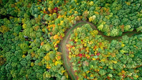
figure element.Esse animi distinctio ea, ipsum error atque, dolore, quod similique, assumenda molestiae porro. Laboriosam vero commodi. Aspernatur sint quasi harum repellat debitis, perferendis error ab deserunt facilis assumenda excepturi libero, expedita doloribus reiciendis, quae necessitatibus ut ipsa eaque.
Photos courtesy of Unsplash
The Code
HTML
<!-- ======================== -->
<!-- ==== Media Object 1 ==== -->
<!-- ======================== -->
<div class="media">
<h2 class="media__heading">Media Object 1</h2>
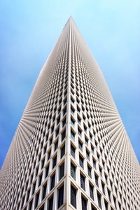
<img src="img/building.jpg" alt="Low-angle shot of a tall white building pointing to a blue sky" class="media__asset">
<p>Notice that the content in this column doesn’t wrap underneath the photo. This is the secret:</p>
<pre><code> grid-row: 1 / span 20;</code></pre>
<p>It’s applied to the <code>img</code>, telling it to occupy rows 1 through the <code>span</code> value. I chose “20” as an artificially high number; you could modify it to suit your needs. As long as it’s at least as high as the number of grid items other than the image, it’ll work. This example has 5 grid items other than the image: the heading, a paragraph, a <code>pre</code> element, and two more paragraphs. Grid doesn’t render the remaining 15 rows (that is, the 20 minus the 5) because they’re empty and we didn’t give them an explicit height. So by using a high <code>span</code> value, the same CSS can be used for media objects with varying amounts of grid items.</p>
<p>By comparison, creating this in Flexbox requires wrapping this column’s content in a <code>div</code> or similar container.</p>
</div>
<!-- ================================= -->
<!-- ==== Media Object 2: Flipped ==== -->
<!-- ================================= -->
<div class="media media--flipped">
<h2 class="media__heading">Media Object 2: Flipped</h2>
<p>In this case, the <code>img</code> comes after the other content in the HTML (although it doesn’t have to). The CSS is the same except for this addition:</p>
<pre><code> .media--flipped {
grid-template-columns: 1fr auto;
grid-auto-flow: column;
}</code></pre>
<p>That class goes on the element that wraps the entire media object. So, whereas Example 1 uses <code><div class="media"></code>, this one uses <code><div class="media media--flipped"></code>.</p>
<img src="img/building.jpg" alt="Low-angle shot of a tall white building pointing to a blue sky" class="media__asset">
</div>
<!-- ====================================== -->
<!-- ==== Media Object 3: Kitchen Sink ==== -->
<!-- ====================================== -->
<div class="media">
<h2 class="media__heading">Media Object 3: Kitchen Sink</h2>
<img src="img/woman.jpg" alt="A woman smiling and laughing" class="media__asset">
<p>This one includes a little bit of everything, including nested media objects. It could include another image, an image in a figure, a table, a form, buttons—whatever you’d like. The CSS is the same.</p>
<!-- :::: Start nested media object 1 :::: -->
<div class="media">
<img src="img/woman.jpg" alt="A woman smiling and laughing" class="media__asset">
<h3 class="media__heading">Nested Media Object</h3>
<p>Recusandae voluptatum obcaecati quam qui maxime minima reprehenderit dolore enim consequatur, culpa odit hic?</p>
<p>Provident reiciendis, illo distinctio repellendus dolores impedit, debitis!</p>
</div>
<!-- end nested media object 1 -->
<p>An unordered list:</p>
<ul>
<li>list item one</li>
<li>list item two</li>
<li>list item three</li>
</ul>
<!-- :::: Start nested media object 2 :::: -->
<div class="media media--flipped">
<img src="img/woman.jpg" alt="A woman smiling and laughing" class="media__asset">
<h3 class="media__heading">Nested Media Object: Flipped</h3>
<p>This uses the same <code>.media--flipped</code> class as the first flipped example.</p>
</div>
<!-- end nested media object 2 -->
<figure>
<img src="img/trees.jpg" alt="Aerial view of winding path through colorful forest">
<figcaption>An image in a <code>figure</code> element.</figcaption>
</figure>
<p>Esse animi distinctio ea, ipsum error atque, dolore, quod similique, assumenda molestiae porro. Laboriosam vero commodi. Aspernatur sint quasi harum repellat debitis, perferendis error ab deserunt facilis assumenda excepturi libero, expedita doloribus reiciendis, quae necessitatibus ut ipsa eaque.</p>
</div>
<p class="Credit">Photos courtesy of <a href="https://unsplash.com/">Unsplash</a></p>
CSS
/* Required for media object
-------------------------------------- */
@media (min-width: 40rem) {
  /* :::: Typical media object :::: */
  .media {
    display: grid;
    grid-column-gap: 30px;
    grid-template-columns: auto 1fr;
  }
  .media__asset {
    /* set span to (at a minimum) the max # of
      grid items to appear next to the img */
    grid-column-start: 1;
    grid-row: 1 / span 20;
  }
  /* :::: Flipped media object :::: */
  .media--flipped {
    grid-template-columns: 1fr auto;
    grid-auto-flow: column;
  }
  .media--flipped .media__asset {
    grid-column-start: 2;
  }
}

/* Allow images to shrink */
.media img {
  max-width: 100%;
}

/* Generic styles for demo purposes
-------------------------------------- */
/* (none of these are required for media object) */
.media {
  background-color: #f3f3f3;
  border: 1px solid #ddd;
  font-family: Helvetica, Arial, sans-serif;
  font-size: 1.0625rem;
  line-height: 1.375;
  margin-bottom: 40px;
  max-width: 800px;
  padding: 25px;
}

.media > * {
  margin-top: 0;
}

.media .media {
  background-color: #ddd;
  border: none;
}

.media__heading {
  font-size: 1.625rem;
  line-height: 1.1;
  margin-bottom: .5em;
}

.media .media .media__heading {
  font-size: 1.2rem;
}

.media > :last-child {
  margin-bottom: 0;
}

.media code {
  font-size: .925em;
  padding: 3px 2px;
}

.media code,
.media pre {
  background-color: #ddd;
}

.media pre {
  padding: 5px;
}

.media p + ul {
  margin-top: -.75em;
}

.media figure {
  margin-bottom: 1em;
  text-align: center;
}

.media figure img {
  display: inline-block;
}

.media figcaption {
  font-family: "Times New Roman", Times, serif;
}