Features Unit
We’ve all seen this pattern: a unit with three or more columns of product features, available service plans, or the like. Grid makes laying this out incredibly trivial, and it reduces the amount of HTML that’s required. Without Grid, we’ve typically added a <div>, <li>, or other element around the content we needed to display in its own column. But with Grid, no column wrappers are needed!
The Finished Example Layout
Features
Feature 1
Lorem ipsum dolor sit amet, consectetur adipisicing elit. Porro nostrum harum tempore beatae magnam nihil at id.
Learn MoreFeature 2
Amet deserunt pariatur, cum autem tenetur tempore itaque! Et unde amet eos maxime tempora optio quaerat a perferendis.
Learn MoreFeature 3
Cumque eius sed accusamus voluptatem, magni minus, obcaecati culpa quasi possimus optima!
Learn MoreThe Code
HTML
<section class="container">
<!--
In practice, I would add classes below for styling hooks. But for this demo I wanted to keep the HTML clean so it would be obvious to you that no wrapper (such as a div) is required around each feature group to make it display in its own column. Thank you, Grid!
-->

  <h1>Features</h1>

  <h2>Feature 1</h2>
  <p>Lorem ipsum dolor sit amet, consectetur adipisicing elit. Porro nostrum harum tempore beatae magnam nihil at id.</p>
  <a href="#">Learn More</a>

  <h2>Feature 2</h2>
  <p>Amet deserunt pariatur, cum autem tenetur tempore itaque! Et unde amet eos maxime tempora optio quaerat a perferendis.</p>
  <a href="#">Learn More</a>

  <h2>Feature 3</h2>
  <p>Cumque eius sed accusamus voluptatem, magni minus, obcaecati culpa quasi possimus optima!</p>
  <a href="#">Learn More</a>
</section>
CSS
/* Grid
-------------------------------------- */
/* Don't display as a Grid unless viewport at least this wide. */
@media (min-width: 40rem) {
  /* Define the grid */
  .container {
    display: grid;
    grid-gap: 30px 80px;
    grid-template-columns: repeat(3, 1fr);
    grid-template-rows: repeat(4, auto);
    grid-auto-flow: column;
  }
  /* Only item we need to explicitly place on the grid. */
  .container h1 {
    grid-column: 1 / -1;
  }
}

/* Generic styles for demo purposes
-------------------------------------- */
.container {
  font-family: Georgia, serif;
  background-color: #f3f3f3;
  border: 1px solid #ddd;
  margin-bottom: 40px;
  padding: 34px 40px 40px;
  text-align: center;
}

.container h1 {
  font-size: 2.25rem;
  letter-spacing: .2rem;
  line-height: 1;
  margin-bottom: 10px;
  margin-top: 0;
  text-transform: uppercase;
}

.container h2 {
  font-size: 1.75rem;
  font-weight: normal;
  line-height: 1;
  margin-bottom: 0;
}

@media (max-width: 39.9375rem) {
  .container h2 {
    /* add breathing room between each feature in narrow viewports since the Grid layout isn't showing */
    margin-top: 45px;
  }
}

@media (min-width: 40rem) {
  .container h2,
  .container p {
    margin: 0;
  }
}

.container p {
  font-size: 1.0625rem;
  line-height: 1.5;
}

.container a {
  background-color: #c4c4c4;
  border-radius: 2px;
  color: #373434;
  display: block;
  max-width: 140px;
  padding: 15px 25px;
  text-decoration: none;
  margin-left: auto;
  margin-right: auto;
}
How Does It Work?
Putting this layout together is pretty straightforward once you’re familiar with some of the main concepts of Grid. I’ll show you how to do it in three simple steps.
First, if you haven’t already done so, please take a moment to get familiar with the HTML above since I won't repeat it below. Please also take special note of my comment in the HTML about why I (mostly) didn’t use classes in this example but would under normal circumstances.
Step 1: Define the grid
First, we define the 4 x 3 grid (rows x columns) with:
.container {
  display: grid;
  grid-gap: 30px 80px; /* 30px gap between rows, 80px gap between columns */
  grid-template-columns: repeat(3, 1fr); /* same as 1fr 1fr 1fr */
  grid-template-rows: repeat(4, auto); /* same as auto auto auto auto */
}
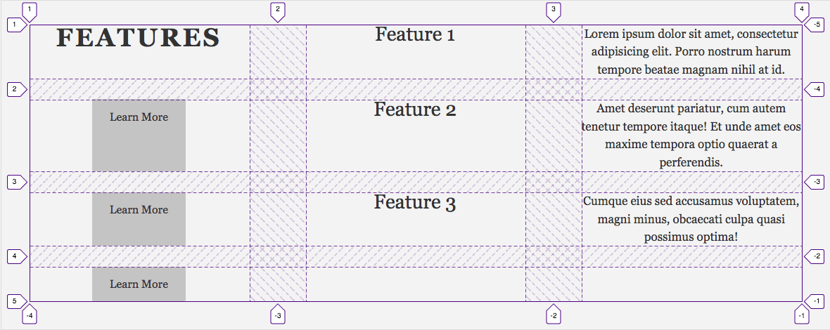
Just by doing that, Grid auto-places each item into its own 1 x 1 grid cell, as shown in Fig 1. Believe it or not, we’re only a few lines off from finishing the layout.
Step 2: Expand the main heading
Occupying one grid cell is perfect for most of the content, but we want the “FEATURES” heading to run across all three columns, so we do this:
.container h1 {
  background-color: red; /* temporary to make a point */
  grid-column: 1 / -1;
  /*
  Two other ways to achieve the same result:
  grid-column: 1 / 4; ("i.e., start at column grid line 1 and end at 4")
  grid-column: span 3; ("i.e., span 3 columns")
  */
}
That’s shorthand for “start the item at the first grid line (1), and end it at the last explicit column grid line (-1).” Specifically, it’s shorthand for grid-column-start: 1 and grid-column-end: -1. So if you were to add or remove columns (by changing the grid-template-columns value on .container), “FEATURES” would still span all columns without your having to do anything.
You probably noticed I provided two alternative approaches in a comment. Which syntax you use often comes down to personal or team preference; there’s no right or wrong way. I tend to prefer the span n approach, because it’s clear at a glance how many columns or rows an item fills. In that sense, it helps make your code self-documenting. But I used 1 / -1 here as an excuse to show -1 in action.
Here’s our updated layout (Fig 2). I temporarily set the heading’s background to red so it would be clear that the heading is spanning all columns rather than just being placed in row 1, column 2. (Remember, the numbers shown by Firefox’s Grid Inspector are the grid lines, not the column and row numbers.)
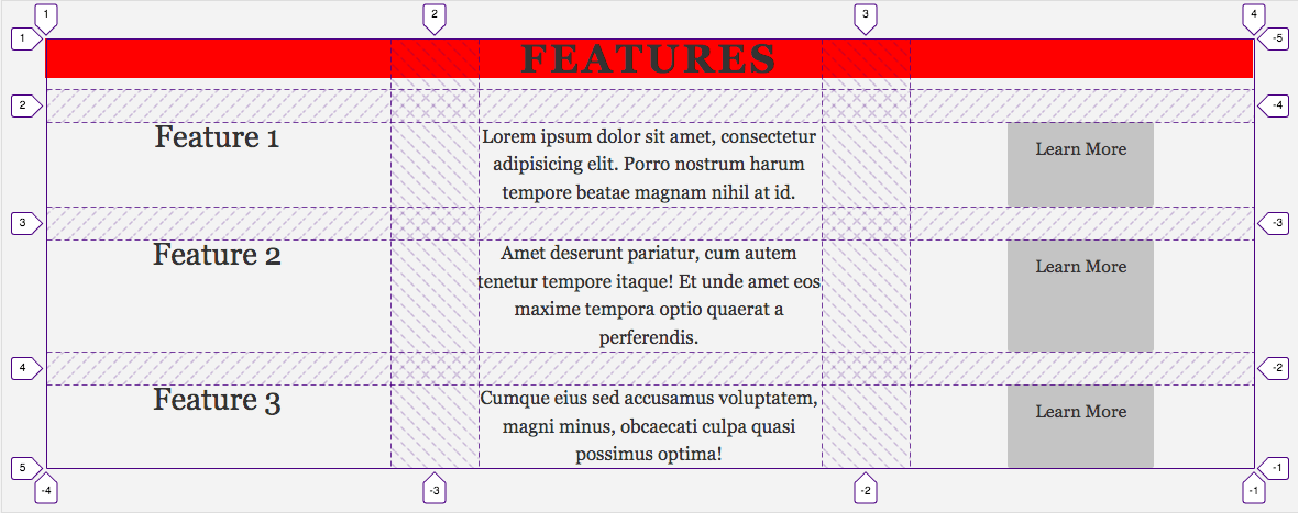
In case you’re wondering, the short space below the red and until the closest dashed horizontal line is a 10px bottom margin I set on the heading elsewhere in the code.
So we’re close. We just need to make the info for the features run down columns instead of across rows.
Step 3: Change auto-flow direction to column
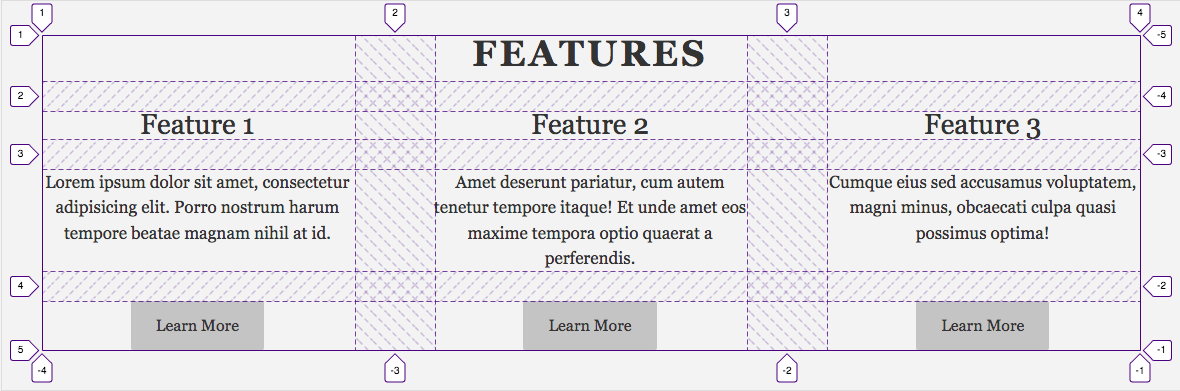
As I noted earlier, by default, Grid auto-places grid items across rows instead of down columns. We can flip that simply by setting grid-auto-flow: column.
.container {
  display: grid;
  grid-auto-flow: column; /* we’ve added this. overrides default "row" value. */
  grid-gap: 30px 80px;
  grid-template-columns: repeat(3, 1fr);
  grid-template-rows: repeat(4, auto);
}
Now Grid’s auto placement algorithm places the grid items in this sequence:
- “Feature 1” heading in row 2, column 1.
- That feature’s blurb in row 3, column 1.
- That feature’s “Learn More” link in row 4, column 1.
- Grid has run out of rows to automatically place content, so it jumps to the next available grid cell, which is row 2, column 2. It places the “Feature 2” heading there.
- And so on until every item has a place to live.
A few words on responsiveness
You may have spotted this media query surrounding the rules defining our grid.
/* Don't display as grid unless viewport at least this wide. */
@media (min-width: 40rem) {
 ...
}
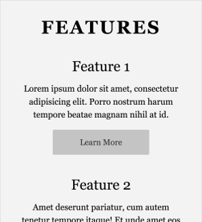
CSS Grid brings responsiveness for free, so you’ll notice the Features Unit shrinks or expands as you manipulate the browser’s width. But the layout would have failed had we applied Grid universally. Namely, the three columns wouldn't fit (either comfortably or at all) in narrow viewports, such as those on most phones in portrait mode.
So we let the features run vertically by default (Fig 4.), and then turn on the Grid layout only once the viewport matches the minimum width set in that media query. Other than that, there’s a little massaging of margins to add space between the features when not in Grid mode.
Finis! Thanks ...
and see you next time!