Catalog Layout
You’ve probably seen this kind of layout in a furniture or decor catalog: products with transparent backgrounds, artfully positioned and floating in space. I can’t promise the artfully part in the example below, but I did try to maintain the spirit of that design approach while showcasing CSS Grid’s ability to realize a non-traditional layout.
Specifically, I wanted to demonstrate how to make grid items cross into each other’s vertical and/or horizontal space while an underlying grid (4 x 4, in this case) holds it all together. When reviewing the CSS, pay special attention to the grid-template-areas value—it indicates how the items are positioned on the grid. The full stop/period in a line like radio radio . camera means an empty column cell.
And if you’re on a non-touch device, hover over the photos for a little extra fun.
The Finished Example Layout
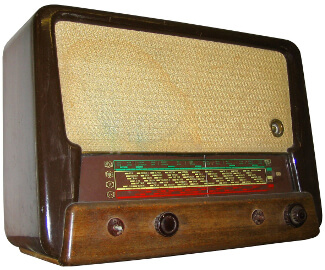 Product Name
$180
Product Name
$180
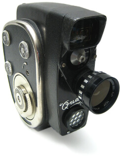 Product Name
$230
Product Name
$230
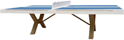 Product Name
$750
Product Name
$750
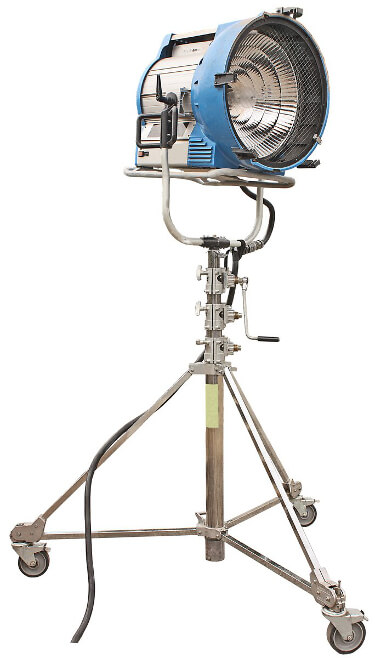 Product Name
$600
Product Name
$600
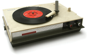 Product Name
$300
Product Name
$300
Images courtesy of FreeImages.com/Antonio Jiménez Alonso (light, ping-pong table), FreeImages.com/Brano Hudak (radio), and FreeImages.com/Jean Scheijen (camera, record player). Layout inspired by LA Home magazine’s summer 2015 issue, p. 27.
The Code
HTML
<section class="products">
  <a href="#" class="item radio">
    <img src="img/radio.jpg" alt="">
    Product Name
    <span class="price">$180</span>
  </a>

  <a href="#" class="item camera">
    <img src="img/camera.jpg" alt="">
    Product Name
    <span class="price">$230</span>
  </a>

  <a href="#" class="item ping-pong">
    <img src="img/ping-pong.jpg" alt="">
    Product Name
    <span class="price">$750</span>
  </a>

  <a href="#" class="item light">
    <img src="img/light.jpg" alt="">
    Product Name
    <span class="price">$600</span>
  </a>

  <a href="#" class="item record-player">
    <img src="img/record-player.jpg" alt="">
    Product Name
    <span class="price">$300</span>
  </a>
</section>

<p class="Credit Credit--ctr">Images courtesy of
<a href="https://www.freeimages.com/photographer/Capgros-58778" rel="external">FreeImages.com/Antonio Jiménez Alonso</a> (light, ping-pong table), <a href="https://www.freeimages.com/photographer/branox-58213" rel="external">FreeImages.com/Brano Hudak</a> (radio), and <a href="https://www.freeimages.com/photographer/vierdrie-46406" rel="external">FreeImages.com/Jean Scheijen</a> (camera, record player). Layout inspired by <cite>LA Home</cite> magazine’s summer 2015 issue, p. 27.</p>
CSS
/* Grid
-------------------------------------- */
/* No grid by default, so provide vertical separation between items stacked vertically */
@media (max-width: 47.9375rem) {
  .item {
    margin-bottom: 70px;
  }
}

/* Define the grid */
@media (min-width: 48rem) {
  .products {
    display: grid;
    grid-template-columns: minmax(275px, 400px) 65px minmax(225px, 335px) minmax(200px, 300px);
    grid-template-areas:
      "radio  radio   .      camera"
      ".      light   light  camera"
      "pong   light   light  record"
      ".      light   light  record";
    margin-left: -5vw;
  }
  /* Place and align items on the grid */
  .radio {
    grid-area: radio;
    justify-self: end;
    z-index: 1;
  }
  .camera {
    align-self: center;
    grid-area: camera;
  }
  .ping-pong {
    align-self: start;
    grid-area: pong;
    transform: rotate(-15deg) translate(110px, 60px);
    z-index: 1;
  }
  .light {
    grid-area: light;
    margin-top: -100px;
  }
  .record-player {
    align-self: center;
    grid-area: record;
    justify-self: center;
  }
}

/* Generic styles for demo purposes
-------------------------------------- */
.item,
.item img,
.price {
  display: block;
}

.item {
  color: #222;
  font-size: 1.125rem;
  font-family: "Arial Narrow", Arial, sans-serif;
  text-align: center;
  text-decoration: none;
}

@media (min-width: 48rem) {
  .item {
    font-size: 0.9375rem;
    transition: all .2s ease-in-out;
  }
  .item:hover {
    transform: scale(1.05);
  }
}

.item img {
  margin: 0 auto 5px;
  max-width: 100%;
}

@media (min-width: 48rem) {
  .products {
    margin-bottom: 30px;
    margin-top: 40px;
  }
}